Introduction
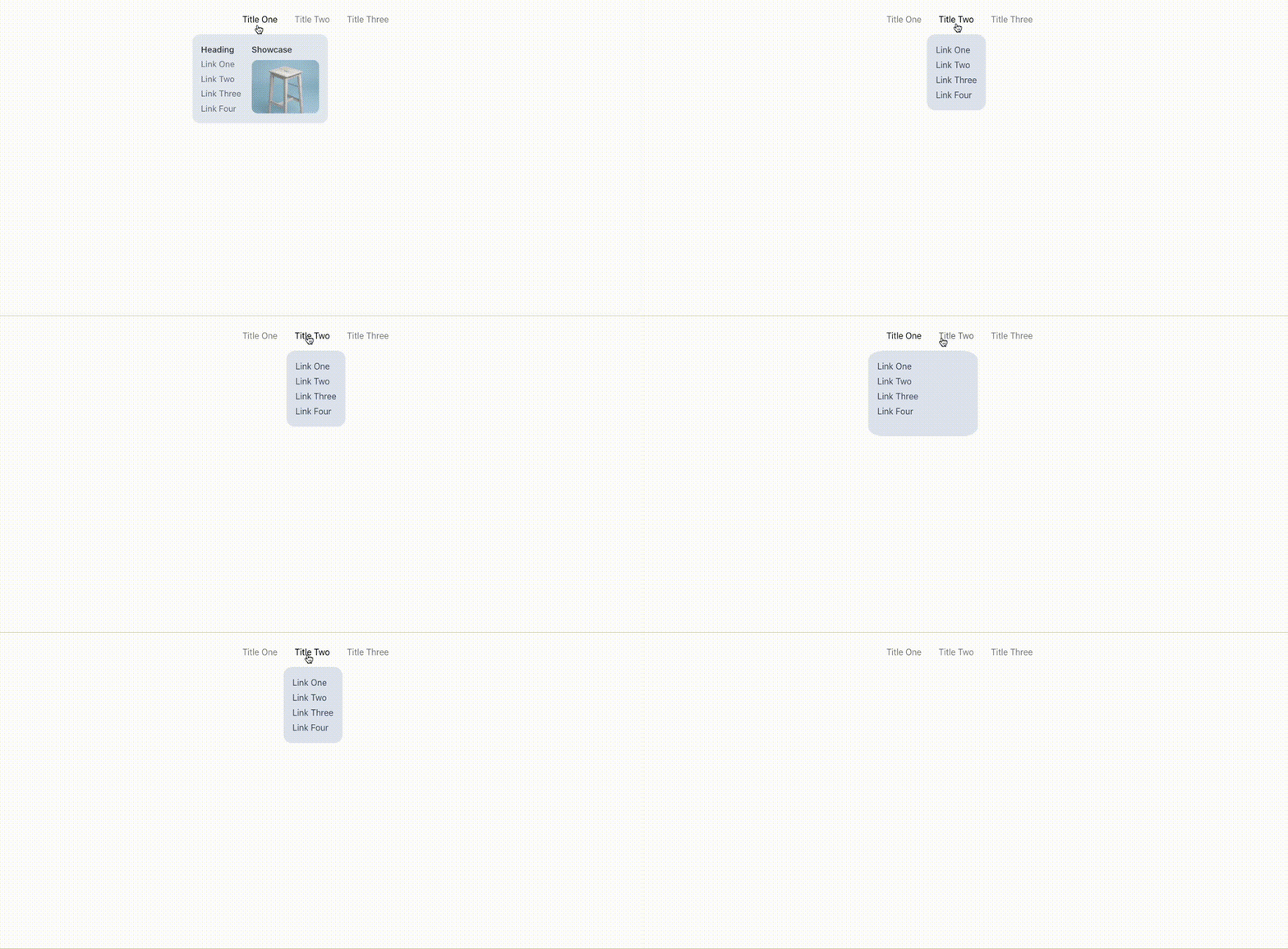
Hey everyone in this tutorial we will create an awesome animated dropdown menu using chakra-UI and framer-motion.
we will be using next.js in this tutorial but you are free to use it on any react project.
so to get started let's set up our initial repository.
in your terminal run these commands
npx create-next-app my-project
cd my-project
so once we are done with the next.js app setup.
let's go to pages/_app.js and wrap the whole app with ChakraProvider.
import '@/styles/globals.css';
import { ChakraProvider } from '@chakra-ui/react';

export default function App({ Component, pageProps }) {
  return (
    <ChakraProvider>
      <Component {...pageProps} />
    </ChakraProvider>
  );
}
Now,
Let's create a new folder in the root of our repository and let's call it components.
under components let's create three subfolders - Menu, MotionBox, and MotionText
so let's start with Menu the component that is gonna be the parent component of our awesome menu.
Menu -
Menu/index.js
import React, { createContext, useContext, useState } from 'react';
import { Box, Flex } from '@chakra-ui/react';
import MotionBox from '../MotionBox';
import MotionText from '../MotionText';

// Framer Motion transition Property
const transition = {
  type: 'spring',
  mass: 0.5,
  damping: 11.5,
  stiffness: 100,
  restDelta: 0.001,
  restSpeed: 0.001,
};

const MenuContext = createContext(null);

const useMenu = () => useContext(MenuContext);

export const Menu = ({ children }) => {
  const [activeItem, setActiveItem] = useState(null);

  return (
    <MenuContext.Provider value={{ activeItem, setActiveItem }}>
      <Flex
        as="nav"
        display="inline-flex"
        p={8}
        gap={8}
        onMouseLeave={() => setActiveItem(null)}
      >
        {children}
      </Flex>
    </MenuContext.Provider>
  );
};
about Menu Component -
It has a state which is
activeItem, which will help us in determining and setting the currently active item which is hovered over.we are using
useContexthook to create aMenuContextwhich will help us in passing our state to other components.we are wrapping the children of our component with Flex provided by chakra so that we can align the items in line.
now let's create another component in
Menu/index.jswhich is gonna be MenuItem
Menu Item -
import React, { createContext, useContext, useState } from 'react';
import { Box, Flex } from '@chakra-ui/react';
import MotionBox from '../MotionBox';
import MotionText from '../MotionText';

const transition = {
  type: 'spring',
  mass: 0.5,
  damping: 11.5,
  stiffness: 100,
  restDelta: 0.001,
  restSpeed: 0.001,
};

const MenuContext = createContext(null);

const useMenu = () => useContext(MenuContext);

export const MenuItem = ({ item, children }) => {
  const menu = useMenu();
  return (
    <Box
      pos="relative"
      color="white"
      onMouseEnter={() => {
        menu.setActiveItem(item);
      }}
    >
      <MotionText
        color="rgba(0,0,0, 0.5)"
        animate={{
          color:
            menu.activeItem === item ? 'rgba(0,0,0, 1)' : 'rgba(0,0,0, 0.5)',
        }}
        transition={{ duration: 0.25 }}
        cursor="pointer"
      >
        {item}
      </MotionText>
      {menu.activeItem !== null && (
        <MotionBox
          initial={{ opacity: 0, scale: 0.85 }}
          animate={{ opacity: 1, scale: 1 }}
          transition={transition}
        >
          {menu.activeItem === item && (
            <Box
              pos="absolute"
              top="calc(100% + 1rem)"
              left="50%"
              transform="translateX(-50%)"
            >
              <MotionBox
                layoutId="active"
                bg="gray.200"
                rounded="2xl"
                overflow="hidden"
                borderWidth="1px"
                borderColor="whiteAlpha.200"
                transition={transition}
              >
                <MotionBox layout w="max-content" h="100%" p={4}>
                  {children}
                </MotionBox>
              </MotionBox>
            </Box>
          )}
        </MotionBox>
      )}
    </Box>
  );
};

export const Menu = ({ children }) => {
  const [activeItem, setActiveItem] = useState(null);

  return (
    <MenuContext.Provider value={{ activeItem, setActiveItem }}>
      <Flex
        as="nav"
        display="inline-flex"
        p={8}
        gap={8}
        onMouseLeave={() => setActiveItem(null)}
      >
        {children}
      </Flex>
    </MenuContext.Provider>
  );
};
about MenuItem -
as the name suggests
MenuItemwill be used as an individual item on our menu.it takes in two props
item,children.item
propis used to set up the currently active item based on which we will show our children and also as the title for our dropdown menu.
now that we have our basic structure added let's add some animation using framer-motion
Motion Box -
import { motion, isValidMotionProp } from 'framer-motion';
import { forwardRef, chakra } from '@chakra-ui/react';

const MotionBox = motion(
  forwardRef((props, ref) => {
    const chakraProps = Object.fromEntries(
      Object.entries(props).filter(([key]) => !isValidMotionProp(key)),
    );
    return <chakra.div ref={ref} {...chakraProps} />;
  }),
);

export default MotionBox;
MotionBox is used to animate the div or children, it is using forwardRef from React to forward the ref to our chakra.div and we are also wrapping the whole component under motion so that we can provide framer-motion properties to it.
we are also checking if the properties are valid or not using the utility function isValidMotionProp provided by framer-motion.
Now that we have our animation wrapper for our div let's create the animation wrapper for our text.
MotionText -
import { motion } from 'framer-motion';
import { Text } from '@chakra-ui/react';

const MotionText = motion(Text);

export default MotionText;
ok so now that we have all of our components ready to go let's create our awesome navigation menu.
go to pages/index.js and create your menu using the components.
import React from 'react';
import { Stack, Text, Center, Link, HStack, Img } from '@chakra-ui/react';
import { Menu, MenuItem } from '@/components/Menu';

function App() {
  return (
    <div>
      <Center>
        <Menu>
          <MenuItem item="Title One">
            <HStack spacing={5} alignItems="start">
              <Stack spacing={1}>
                <Text color="gray.800" fontWeight={600}>
                  Heading
                </Text>
                <Link color="gray.600">Link One</Link>
                <Link color="gray.600">Link Two</Link>
                <Link color="gray.600">Link Three</Link>
                <Link color="gray.600">Link Four</Link>
              </Stack>
              <Stack spacing={2}>
                <Text color="gray.800" fontWeight={600}>
                  Showcase
                </Text>
                <Img
                  h="6.4rem"
                  w="8rem"
                  bg="whiteAlpha.50"
                  src="/secondary.avif"
                  objectFit="cover"
                  rounded="xl"
                  cursor="pointer"
                  alt="Beverage Can"
                />
              </Stack>
            </HStack>
          </MenuItem>
          <MenuItem item="Title Two">
            <Stack spacing={1}>
              <Link color="gray.600">Link One</Link>
              <Link color="gray.600">Link Two</Link>
              <Link color="gray.600">Link Three</Link>
              <Link color="gray.600">Link Four</Link>
            </Stack>
          </MenuItem>
          <MenuItem item="Title Three">
            <Stack spacing={1}>
              <Link color="gray.600">Link One</Link>
              <Link color="gray.600">Link Two</Link>
              <Link color="gray.600">Link Three</Link>
              <Link color="gray.600">Link Four</Link>
            </Stack>
          </MenuItem>
        </Menu>
      </Center>
    </div>
  );
}

export default App;
Conclusion
That's all I have for you! Hopefully, you learned something new.
If you enjoyed this article, give it a ❤️ so others can find it too.
For more such content, stay in touch.
Contact Me:


Top comments (0)