Or, how we’re destroying users’ trust, and how to get it back. Check out the first post in this series as well: Building a Great UX Outside of Your App.
There is a direct connection between all the unnecessary notifications you get on your phone and the sub-prime financial crisis of 2008. The connection is human behavior in a large and anonymous marketplace where bad behavior is rarely punished.
In a recent Hackernews post, I posited the same connection: that apps that send notifications are facing a systemic collapse where users will be so overwhelmed with mass notifications that most of them will opt out entirely. One user responded with a great synopsis of the problem:
Unfortunately if it drives engagement of 2 people at the expense of becoming annoying to one person the app developers will keep over-using notifications.
I’d add one further sad corollary to this observation: as long as other app developers are over-using notifications, it’s irrational for you the app developer not to. As you compete for attention on users’ devices, you will fall behind your competitors if you don’t emit a few notifications a day. So even though your individual action hurts the user experience overall, it can be irrational for you to avoid doing so.
As any fan of financial crises can tell you, the subprime bubble, where lenders created AAA-rated securities out of extremely shaky mortgage lending, was not an evil scheme dreamed up by nihilists. Rather, it was the act of rational people acting in their own best interests. As long as other banks were selling junk securities at high markups, it wasn’t rational for one bank to stop, even when they knew the system couldn’t go on forever. As former Citigroup CEO Chuck Prince infamously said, “as long as the music is playing, you have to keep dancing.”
What the crash would look like
Any time I start a discussion on Reddit or Hackernews about what users want in notifications, most commenters say that they want out of notifications entirely. It was only three years ago that most users got ‘do not disturb’ mode on their phones, and more and more users are deciding to stay in Do Not Disturb forever.
Can notifications ‘crash’ the same way that the mortgage market did? Absolutely. The sequence looks like this:
- Increased awareness of unnecessary notifications
- Government regulators request that OS producers limit unnecessary notifications
- All notifications become tightly restricted
- Contacting users via push notifications becomes unreliable
- Application developers no longer invest the time in timely notifications
- With users no longer expecting notifications, developers are forced to go back to email and SMS to contact users at all
The Prisoner’s Dilemma
John Cassidy in his illuminating book How Markets Fail explains that this pattern is in fact a version of the prisoner’s dilemma. The multiple actors in the market aren’t able to coordinate and they end up choosing options that are individually beneficial, but collectively negative.
The sub-prime crisis nearly crashed the global economy and we still live in its shadow. In the world of notifications: every OS release on our phones further limits how apps can notify us, is a similar crisis coming in the market for user attention?
How we break free
A dire situation, surely, but we can do something about it: collaboration. The prisoner’s dilemma doesn’t work nearly as well if the prisoners can communicate and see each other’s choices. In the case of notifications, all that’s required is that we the creators of applications agree to some simple principles for trustworthy notifications.
This move is not without precedent. Multiple industries decided on voluntary pledges of quality and trustworthiness rather than deal with public ire, choosing self-regulation over government regulation. Perhaps you remember this seal from the childhood newsstand:
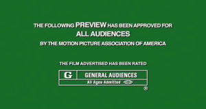
Next to Captain America’s adventures and even Grant Morrison’s Swamp Thing, the Comics Code Authority seal was stamped on the cover of comic books for over 40 years. And perhaps you saw another sign of voluntary self-regulation in an air-conditioned theater this weekend:
Neither of these ratings and advisory boards are without their detractors, and as Comic book fans aged and concerns about violent comics diminished, the comics code has disappeared. However, these do show that a lack of public trust can be addressed by an industry-wide standard.
A pledge for better notifications
Folks, I don’t want to be corny, but I do want us to get better. Here we get to the crux: I want us to agree to do better. Here are the principles that can guide better notifications.
One caveat here: this pledge is not about dark patterns or dishonesty. Tricking the user into spending money unintentionally should be covered by generalized ethics, this is about good design principles for developers who want to build trustworthy tools.
1. Be timely
We often feel bombarded with notifications, so a requirement that they come faster can seem counter-intuitive. But it’s critical that you identify when and with what precision your users expect to be informed. A notification that your web service is down needs to come sooner than the first angry call from a user. And a notification about breaking news needs to come before you say something mean about Queen Elizabeth on Slack.

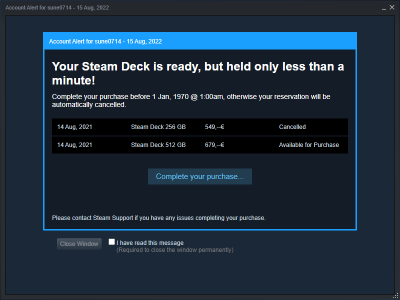
When the Steam Deck inspired a purchasing frenzy, many users complained they got inaccurate notifications, like this classic epoch failure for a user in the UK
Timeliness also means not notifying too quickly. Notifications about how many people liked a cat picture don’t need to arrive at 2:00 AM, they can wait til morning.
The required accuracy of notifications will vary a lot depending on your use case. A scheduling tool like Calendly will need its notifications to arrive on the exact minute we need them to arrive at a meeting on time. A more fun social app probably only needs to send notifications accurately within 30 minutes.

This failure by YouTube may reflect a shift in usage patterns: where previously new and interesting videos didn’t need up-to-the-minute notifications, now users get breaking news and important premieres on YouTube.
2. Be targeted
We may not want our applications to know everything about us, but targeting is a critical part of good notifications. If I ordered Pizza Hut for lunch, I don’t want them notifying me of dinner specials. Look at this not-ideal experience for a user of Accuweather that warned him of thunderstorms…3,000 miles from his current location:

The cut-off text makes the situation worse: it’s easy to assume this is happening in your town!
Some things we’d ideally target in our notifications:
- Geography
- Time Zone
- User’s access level within our service
- Where they are in the user journey
3. Be brief
In the example above from accuweather.com, a slightly wordy notification meant the user didn’t see the area affected by the alert. This is one example of a larger problem: a failure to be brief and to-the-point with notification messages.
Since notifications are often shortened when viewed on different devices, be sure to put the most important information first. Journalists would call this the ‘inverted pyramid’ but I prefer to think of it as a special case of little-endian transmission: the least important information should come last.
A special case of the requirement to be brief is digests: ask yourself if your notifications are more meaningful in a group or one-at-a-time. Notifications of individual ‘likes’ on a post is a great candidate for a digest, as is a long conversation thread.
Ideally since you’re following rule 2 and therefore know the user’s timezone, you can dynamically generate digests when notifications would be sent in the middle of the night for the user.
4. Offer (the right amount of) control
Finally there’s control. If I posted every bad example of user preferences for notifications this article would resemble 2000’s Flickr. But:

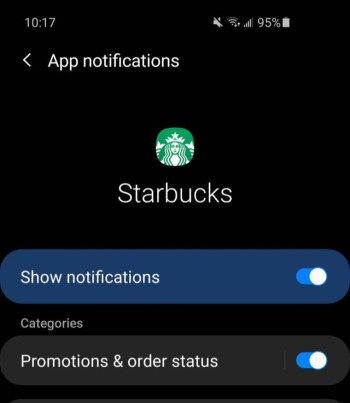
A classic example is Starbucks’ which, for a time, would only tell you order status if you also accepted spam
So we want to offer users real fine-grained controls. But it is possible to get too fine-grained

If you zoom in, this is every notification setting for Google Maps
The solution when you have too many settings is to offer some grouping, so that users can turn off whole categories.
What unifies these needs?
The common thread between all of these requirements is that they all require technical lift. Timeliness, targeting, brevity (with digests), and user preferences all require that we go above and beyond with our notifications service. A simple bulk send email kicked off by a cron job can’t deliver these features without some very sophisticated and un-maintainable regex. The solution then is to have a notifications service that can offer these features in a lightweight experience for our product team.
In the last article of this series, we’ll cover how you can build a great notification experience without using Courier.


Top comments (0)