Apple’s shiny Benchmark Metrics are BS, but don’t be fooled.
I learned that the hard way while feeling proud of myself as I rearranged screenshots, polished keywords, and declared I’d cracked the code. Smart Keys conversion rate soared, my proceeds per user looked stellar, and I’d pat myself on the back every time I glanced at the numbers.
Then it hit me that I was clinging to illusions, metrics that look good on paper but hide the gritty reality of crashes, retention, and actual profitability.
Here’s the short version of what I learned:
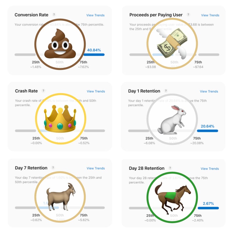
💩 1. Store Conversion: Ads and external promotions can juice your stats, making conversion look like a high score when it’s basically pay-to-win.
💸 2. Proceeds per Paying User: This can appear golden, until you remember acquisition costs can burn a hole in your wallet.
👑 3. Crashes: This is real gold. On a small team, testing across all devices and iOS versions is no walk in the park, this metric shows you if your app is on fire before the reviews come in hot.
🐎 4. Retention (D1, D7, D28): A slow-burn test of whether users actually come back. Trial periods and paywalls can skew it, so patience is key.

The truth is, Apple’s polished dashboards won’t give you the full picture. I’ve learned more from Every Inc. and the community #BuildingInPublic than from any set of curated stats or ASO gurus.
Want to dive deeper into the real numbers and see how I’m trying to keep things honest? Check out the full metrics and analysis on my blog at diego.horse.
Is any of these metrics relevant to you? Which metric should I dive into next?
Have a good week filled with no-BS insights.
(っ-,-)つ𐂃


Top comments (0)