Introduction
In this article, I'll show you how to create an infinite scrolling effect using an image as your background. We'll use 2 classes and the keyframes for animation purposes.
You'll need:
This is the final result: Codepen
HTML
Let's start with the HTML. I'll use 2 classes.
<div class="container">
  <div class="infinite-scrolling"></div>
</div>
The HTML code includes a div element with class container, which contains another div element with class infinite-scrolling. This is a common structure used in web development to create a container element that holds other elements.
CSS
Now let's do some magic!
I'll define the container and then the infinite-scrolling.
.container {
  overflow: hidden;
}
The CSS code sets the overflow property of the container div to hidden, which means any content that extends beyond the container's dimensions will be hidden from view.
.infinite-scrolling {
  background: url("https://static.vecteezy.com/system/resources/previews/001/928/973/original/rural-nature-road-scene-free-vector.jpg") repeat-x;
  height: 645px;
  width: 5760px; /* The image width times 3 */
}
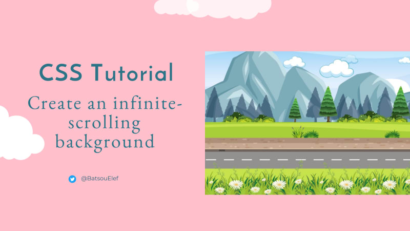
The infinite-scrolling class sets the background of the div element to an image located at the URL specified in the background property. In this case, the image repeats horizontally (repeat-x) to create the effect of an infinitely scrolling background!
The height property of the infinite-scrolling class is set to 645px, which determines the height of the scrolling background. The width property is set to 5760px, which is the width of the image multiplied by 3, so that the image repeats three times horizontally. (So, the size of the image I picked is 1920x645.)
If you're not sure you're understanding the above code block keep reading this section, else you may continue to ANIMATION.
The width property of the .infinite-scrolling class is set to 5760px, which is three times the width of the background image. This is done to create the effect of an infinitely scrolling background that seamlessly repeats itself.
When the background image is repeated using the repeat-x value of the background-repeat property, the image is repeated horizontally to fill the width of the container element. By setting the width of the .infinite-scrolling element to three times the width of the background image, it ensures that there are always three copies of the background image visible on the screen at any given time.
As the background image starts scrolling from right to left, the first copy of the image disappears off the left edge of the screen and the fourth copy of the image becomes visible on the right edge of the screen, creating the illusion of an infinitely scrolling background. Without setting the width to three times the width of the background image, the scrolling effect would not be seamless because there would be a gap between the end of the first image and the beginning of the second image.
ANIMATION
And to the fun part! Let's add the animation. We'll need to add one more line to the previous CSS class. Here's how it's going to look.
.infinite-scrolling {
  background: url("https://static.vecteezy.com/system/resources/previews/001/928/973/original/rural-nature-road-scene-free-vector.jpg") repeat-x;
  height: 645px;
  width: 5760px; /* The image width times 3 */

  animation: slide 60s linear infinite;
}
The animation property of the infinite-scrolling class specifies an animation called slide, which lasts for 60 seconds (60s), plays in a linear manner, and repeats infinitely (infinite).
Next, we need to set the infinite.
@keyframes slide {
  0% {
    transform: translate3d(0, 0, 0);
  }
  100% {
    transform: translate3d(-1920px, 0, 0); /* The image width */
  }
}
The @keyframes rule defines the slide animation, which specifies how the background image should move across the screen.
The
0%keyframe sets the initial state of the animation, which is that the image is not translated (translate3d(0, 0, 0)).The
100%keyframe sets the final state of the animation, which is that the image is translated by-1920pxalong the x-axis (translate3d(-1920px, 0, 0)), which is equivalent to the width of the image. This causes the background image to move across the screen from right to left, creating the effect of an infinitely scrolling background.
Are you still here? Congrats, you did it!
https://codepen.io/EleftheriaBatsou/pen/qBMaxPN?editors=0100
If you found this tutorial helpful or you do any similar projects feel free to tag me and I'll gladly have a look!
Do you still have any questions or feedback? Please comment below!
Sum up💫
The article explains how to create an infinite scrolling effect using an image as the background on a webpage. It uses CSS to set the background and animation properties, and the @keyframesrule to define the slide animation. By setting the width of the scrolling element to three times the width of the image, the scrolling effect appears seamless.
Thank you for reading! Find the code on Codepen.
👋 Hello, I'm Eleftheria, developer & public speaker.
🥰 If you liked this article, consider sharing it.


Top comments (0)