
Have you noticed dark mode is pretty standard lately?
Well, that's because it's badass!
Let's achieve this new standard of awesome by utilizing styled-components and React!
It's super easy to implement, so let's get straight to it! 💯
Resources
👉 Demo
👉 Repo
Some things I'm expecting you to know
- Development Environment
- Basics in React
- Basic S(C)ass
1. Fresh React project
Let's clean up the file structure ~ if you want. I deleted all unnecessary files for this project. Removing App.css and all testing related files. Be sure to remove necessary lines of code in index.js. I also cleaned up the boilerplate between the header tags.
2. Install and Import styled-components
With a fresh project, let's now install and import styled-components.
-
yarn add styled-componentsor npm install --save styled-components
Let's now import styled-components like so:
import styled from 'styled-components'{% raw %}`
```
---
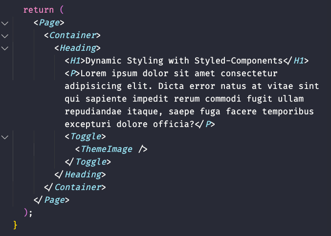
## 3. Let's create a simple landing page with styled-components
In our `App()` let's return a `Page`, `Container`, `Heading`, `H1`, `P`, `Toggle`, and `ThemeImage` component, respectively. It should look like so
---
## 4. Now that we have our layout, let's create each of our components
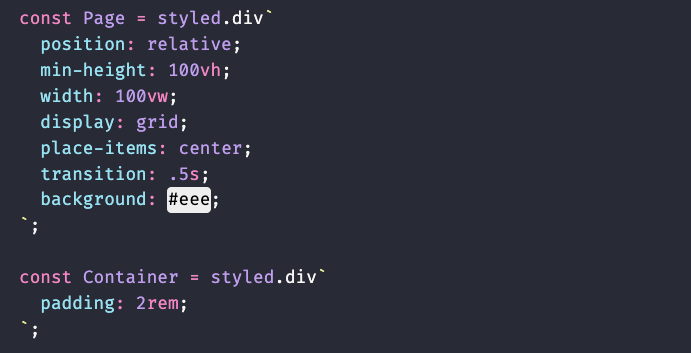
`Page` and `Container`
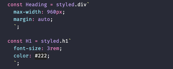
`Heading` and `H1`
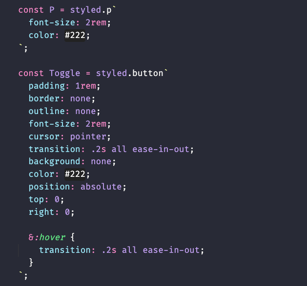
`P` and `Toggle`
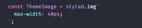
`ThemeImage` is the component that will contain our toggle state images
---
## 5. Let's create state for our toggle component
In order for us to to toggle between light and dark mode, we need to hold state. Let's begin by importing the useState hook. `import {useState} from 'react'`. Then add it to your `App()` component like so:
```javascript
const [isDarkMode, setDarkMode] = useState(false);
```
Next let's add the logic that will toggle between light and dark mode for our button `Toggle` component.
```javascript
const handleToggle = () => {
setDarkMode(!isDarkMode);
// console.log(isDarkMode);
}
```
This functions only responsibility is to toggle the opposite of what the current state is. In other words, if the state is currently `true`, toggling it will become `false`. If `false` it becomes `true`.
---
## 6. Update our `Toggle` component
Now that we have a function that can toggle our light ~ dark state, let's update our `Toggle` component like so:
```javascript
<Toggle onClick={handleToggle}></Toggle>
```
---
## 7. Import images to display the active theme
If we want to show our users the current and next theme, we can do so visually with the use of a Moon and Sun image. Let's import the images at the top of our code like so:
*images are available in the repo*
```javascript
import Moon from './images/moon.png';
import Sun from './images/sun.png';
```
Then lets update our `ThemeImage` component like so:
```javascript
<Toggle onClick={handleToggle}>
<ThemeImage src={ !isDarkMode ? `${Sun}` : `${Moon}` } />
</Toggle>
```
Here we are updating the `ThemeImage` components src attribute as it is an instance of `img`. We are also conditionally setting the image with a simple ternary operator while also utilizing template literals.
I'll explain with some pseudocode. You can read this like `if stateIsNotDarkMode ? render Moon : else render Sun.`
---
## 8. Let's update some style properties in our components
We're almost done! Let's update the `background` and `color` properties in a few of our components
First, Let's change the `Page` components background style to:
```css
background: ${props => props.light ? "#eee" : "#333"};
```
Secondly, let's change the `H1` components color style to:
```css
color: ${props => !props.light ? "papayawhip" : "#000"};
```
Lastly, let's change the `P` components color styles to:
```css
color: ${props => !props.light ? "#eee" : "#333"};
```
Here we are conditionally styling our background or color properties based on the prop that we pass into our components. If the component contains the `light` prop, render this color, else render this color.
---
## 9. Pass in our default Theme to our components with the `light` prop
All we have to do now is update our components in the layout with the default `light` prop. Like so:
```javascript
return (
<Page light={!isDarkMode ? true : false}>
<Container>
<Heading>
<H1 light={!isDarkMode ? true : false}>Dynamic Styling with Styled-Components</H1>
<P light={!isDarkMode ? true : false}>Lorem ipsum dolor sit amet consectetur adipisicing elit. Dicta error natus at vitae sint qui sapiente impedit rerum commodi fugit ullam repudiandae itaque, saepe fuga facere temporibus excepturi dolore officia?</P>
<Toggle light={!isDarkMode ? true : false} onClick={handleToggle}>
<ThemeImage src={ !isDarkMode ? `${Moon}` : `${Sun}` } />
</Toggle>
</Heading>
</Container>
</Page>
);
}
```
Here I am also conditionally rendering the `light` prop to either be true, or false, depending on on our state.
---
## Conclusion! 👏
Congrats! That's a wrap on **No Fuss Dark-Mode Toggle with React & Styled-Components!** Hopefully, if everything went right, you were able to implement a badass dark mode into your project, in 9 simple steps!
Please don't hesitate to hit me up on [Twitter](https://twitter.com/hyggedev) in regards to any questions, concerns or if you just wanna say hello!
---
## Are you a beginner web developer!?


Top comments (23)
That's great advice! I actually was planning on storing a userSettings in local storage but I wanted to make it as absolute barbones as possible 👌 And that's really cool. Is that the exact snippet for any OS? In other words that would take my macs theme preference and apply it to the browser? Same for a windows user? How about if my OS preferred theme is set to detect time of day still work!? 🤯
Hey, Chris, did you know that u have no need to pass theme prop to each component?
Look for ThemeProvider component from styled-components, it gives you opportunity to wrap you whole JSX component with provider which will pass theme prop to all styleds via context, so u will need to pass your theme only to themeProvider
Absolutely! I wanted to make this as easy as possible! But you are the second person to mention this, so I think I'm just gonna have to continue this, possibly as a series! May have to give that a shot 😅 Thanks for your input, it is good advice 🤘
I just came to tell you how badass your caption image looks like. That is really amazing :)
Hahaha! Right on, thanks a lot! I'm super into the cyberpunk genre and it's neon colors, so I guess it worked out. 👌✌️
Something about this caption reminded me on "Stranger Things". And I ABSOLUTELY LOVE that series. :)
Couldn't agree more! The production, cast... top notch. But when the show transitions into the golden age of arcades.. all that eye candy 😎
Isn't it a better approach to have a theme provider at the top level component that would take the theme object as a prop based on the value of isDarkMode, instead of having to do the comparison for each of the components. This is not sustainable for a large project that have many components.
Edit:
I wrote this comment not knowing the suggestion has already been made
Well in my honest opinion you are 💯 percent right! My aim was to basically introduce styled components, and to have the least resistance for entry for beginners. Info have a goal of updating this into a series and introducing React context, dark mode hooks, or themeprovider. Thanks for dropping by!
Thank you
✌️😜✌️
Awesome and smooth.
Hey 👋 Glad ya dig it! Thanks for dropping by ✌️
Thank you very much for this informative article
Amazing dude 🤘 I'ma look more into that D:
Nice post, Chris!
Hey! Thanks a lot! ✌️
Thank you so much, I will to use in my blog 😄😄
That's awesome! ✌️🤘