Today we’ll talk about accessibility.
It’s a practice of creating apps, sites, and products usable for everyone, including people with visual, motor, auditory, speech, or cognitive disabilities.
Why should you support accessibility?
- you can impact someone’s life by making inclusive & easy to use products
- one billion people have disabilities: your product can be used by them
- better accessibility support leads to better UX and cleaner code
In this guide, you’ll find accessibility testing tools, color contrast checkers and color blindness simulators, both for designers and developers who work with web and mobile.
🎨 Tools for making accessible colors
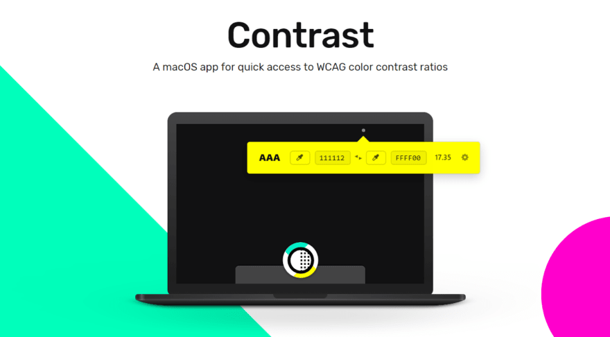
Contrast — simple macOS app to check color contrast ratios and identify accessible color pairings based on WCAG Guidelines.
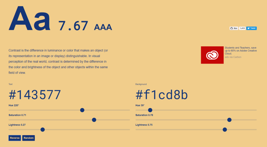
Accessible color palette builder — a great tool for building accessible color palettes. Enter up to 6 colors and see the color matrix to know which colors can be combined.
ColorBox — a tool to algorithmically build accessible color systems. It also sorts by color, hue, saturation, and luminosity when picking color combinations.
Contraste — a free app for checking the accessibility of text against the WCAG rules.
Hex Naw — a free color accessibility tool for testing entire color systems for contrast and accessibility. You can test about 12 different colors at the same time.
90 examples — a free collection of accessible color themes:
- variety of A11Y compliant color combos
- 90 combinations of text/background color that has a sufficient contrast ratio.
Contrast Checker — another free color accessibility tool that helps check the contrast between the background of an element and the page itself.
Colorable — a free web-based contrast tool:
- take a set color palette and get contrast values for every possible combination
- includes pass/fail scores for the WCAG accessibility guidelines.
👓 Color blindness simulators
Stark — a paid Sketch plugin that will let you simulate different types of color blindness.
Color Oracle — a free color blindness simulator. It uses the algorithm for simulating color vision impairment, so you can see colors as they are seen by colorblind people.
Toptal’s color filter — this online tool lets you test your website and shows you how people with different color blindness will see your pages.
🙌 Accessibility testing tools
ANDI — a free accessibility testing tool for web content:
provides automated detection of accessibility issues
gives practical suggestions to improve accessibility and checks 508 compliance.
WAVE — a free web accessibility evaluation tool:
- provides visual feedback by injecting icons and indicators into your page
- has browsers extensions for evaluating local, dynamic, or password-protected pages.
AChecker — a free accessibility testing web app, which allows you to check accessibility by web page URL, HTML file or even markup. Also, it enables additional options, such as CSS, HTML validator and more.
A11ygator — a free web tool to analyze websites against WCAG. Also available as a browser extension and as a Twitter bot. And to find more accessibility tools, check the Awesome Design Tools list.
🙌 Tools for iOS developers
Accessibility Inspector is a part of Xcode, the main IDE for developing iOS apps. Think of it as a built-in accessibility checker that goes through an iOS application and tries to find accessibility issues. Than Accessibility Inspector shows parts of an iOS app that can be done better and helps to check iOS assistive technologies.
VoiceOver helps navigate the app screen without seeing it. It also can be used for testing iOS apps assessability, when you enable it and try to use your app.
VoiceOver gives audible descriptions of what’s on your screen — from battery level, to who’s calling, to which app your finger is on. You can also adjust the speaking rate and pitch to suit your needs. When you touch the screen or drag your finger over it, VoiceOver speaks the name of the item your finger is on, including icons and text. To interact with the item, such as a button or link, or to navigate to another item, use VoiceOver gestures. — iPhone User Guide
Please take a look at Accessibility on iOS section on the Apple site to learn more about assistive technology, which you can support in your iOS app:
Useful Guides & Resources
In this guide, we focused more on tools to help you build products usable for more people rather than assessability practices (which are equally important). So these guides will teach you to follow best practices:
Apple team put together Human Interface Guidelines with many tips on the accessibility in iOS design. It covers user interface, navigation, typography, colors, motion and much more.
Some great articles by the InVision team. Designing for accessibility is not that hard, where you’ll find seven easy-to-implement design guidelines. A guide to color accessibility in product design will be interesting for those of you who want to design with accessibility in mind.
Inclusive Design by Microsoft team is a comprehensive accessibility methodology and a set of useful tools.
Color Contrast for Better Readability is an article to help you establish and use an accessible color palette.
For building your iOS apps more accessible with SwiftUI, learn about development tips for Images, Sort Priority, Named Controls, Dynamic Type, Accessible User Interface, Traits, Attributes, User Settings, and Semantic Views. It’s a great series of 3–4 minutes iOS dev guides written by iOS Engineer at Capital One, Rob Whitaker.
Also, take a look at Checklist: How to make your iOS app more accessible.
With all those tools and knowledge we can create more accessible products, reach a bigger audience and make life better for someone. I think it’s a solid motivation to start supporting accessibility in your design and development.
Originally published at UX Collective


Top comments (10)
Thanks, nice list, that will save me a lot of browsing (browsing that would probably en up watching cats, woodworking, some cosmology article or something about the CRT advantages in modern games, who knows)
And as always is good to keep in mind that accessibility is not something new, in fact appears like we as devs have been actively stripping it away in favor of aesthetics, html and css are accessible by default, responsive by default; we choose to mess things up. This article looks like a good source of resources to add some beauty without loosing functionality.
And to keep at hand for inspiration.
motherfuckingwebsite.com/
bettermotherfuckingwebsite.com/
thebestmotherfucking.website/
Sometimes you need some fanciness, but not always. Every extra Kb, every extra JS LOC has a price for the user, you better make good use of it.
Great collection, thank you for sharing.
Also awesome first post, keep it up! 💪🏻
Thanks for the support! I used to blog on Medium a lot, so indeed this is my first time on dev.to :)
You're welcome! I see - oh wow, You are quite popular on Medium! 😲 Great to have you on dev.to too 😊
thanks 😊
Medium was very good previously, now they put most of the content behind "the paywall" :( That makes knowledge not available to people who can't pay for Medium subscription
Well, bad for Medium and good for platforms like dev.to, where awesome Medium authors like you move to 🙊
To keep it short - Lighthouse uses aXe accessibility rules in its audits. So does Webhint. For extensive a11y testing see accessibilityinsights.io.
Thanks for your recommendations)))
Great list - loving what 90 examples offers, I have not seen that before. Will be very useful in my projects.
Worth mentioning ZingGrid, which I have been using for a while to quickly build tables. As of today, they're now accessible.
Worth checking out. Thanks again for the list!
Edit* - forgot to link --> zinggrid.com
Thanks, the list looks very interesting. However it is all about visual impairment. What about hearing, the other main problem on the net?