
Written by Jude Miracle✏️
An important aspect of many websites these days is file submission features. Whether it’s a job application on a company’s website or pictures and videos on social media apps, it’s crucial to develop user-friendly file upload forms.
However, managing file uploads in web applications can be very difficult and time-consuming. This is because you have to manage the technical aspects of file hosting and storage, server-side authentication, and maintaining a seamless user experience.
This article introduces UploadThing, a tool designed to improve the file upload experience in full-stack TypeScript applications. We’ll walk through how to set up an UploadThing account and navigate the interface, as well as how to customize your upload experience, leverage security features, and integrate UploadThing with tools like Next.js and the Shadcn form. By the end of this article, you should be more confident in managing file uploads in your Next.js app.
What is UploadThing?
 UploadThing is not just another file upload service; it is an open source tool that streamlines the process of adding file upload features to full-stack TypeScript applications. It aims to offer a less complex and more effective substitute for developing custom upload methods or using existing services like Amazon S3.
The process begins with the user initiating communication between their device and the server by requesting upload permissions from the customer's server.
The customer server then authenticates a request and retrieves a temporary post URL from UploadThing's server, which is specific to the upload session. UploadThing's server requests a post URL for a user's upload session, storing metadata and the callback URL for receiving notifications in a database, ensuring efficient file uploading and notification processing.
Then, the post URL is sent back to the user's device. The post URL allows users to upload files directly to storage services like Amazon S3, bypassing the storage management handled by UploadThing.
The Lambda function, triggered when receiving the upload, initiates a serverless code on UploadThing's server, which then initiates a webhook service. The webhook service on UploadThing's server communicates with the customer server via the provided URL, transmitting metadata about the uploaded file.
Some key features of UploadThing include the following:
- It offers pre-built components and hooks for common upload designs, making it simple to incorporate into existing applications
- With libraries on both sides, UploadThing takes care of file uploads from both the client and server side
- UploadThing focuses on providing developers with total ownership and control over how data is stored, accessed, and used
- UploadThing offers components and hooks for various needs, from simple image uploads to customized bulk uploaders, making it easy to integrate into any modern frontend frameworks like Nuxt.js, Astro, SolidStart, SvelteKit, or existing React projects. Developers do not have to worry about compatibility issues as they can use any frontend framework they prefer
- UploadThing offers straightforward and transparent pricing models, making it accessible for a wide range of projects
Prerequisites
In the following sections, we will demonstrate how to use UploadThing within a demo Next.js application. See the docs for information on integration with other frontend frameworks and the backend. To follow along, you will need:
- Node.js to run the demo Next.js application locally
- An UploadThing account
- A basic understanding of JavaScript, React, and Next.js API routes
Let’s get started!
Configuration of UploadThing
To set up an UploadThing project, visit the website and sign in using your GitHub account. Then click Create a new app and fill out the form with the project name, description, and data storage region:  After that, you will be directed to the dashboard. Here, we will get our API key and secret. Navigate to API Keys:
  Hit the Copy button and store the API key and secret somewhere safe for later, when we will use it to authenticate to our frontend.
Setting up our Next.js app
Now, we’ll start up a new Next.js project. Open the terminal and type in the following command:
npx create-next-app@latest
When setting the template, select options that look like the following example:  Select your project configuration,
 cd into the project directory, and start the application. Before we start creating our components, let’s install UploadThing and any other dependencies we will use:
npm install uploadthing @uploadthing/react
After this is done, let’s add our UploadThing APP_ID and secret. Create a .env in our root folder and paste it into your UploadThing endpoints:
UPLOADTHING_SECRET=your secret
UPLOADTHING_APP_ID=your app id"
Swap out UPLOADTHING_SECRET and UPLOADTHING_APP_ID for the values from your UploadThing dashboard.
Creating an UploadThing API route for file uploads
UploadThing uses an endpoint called FileRoute that acts as a blueprint for handling uploads, defining what can be uploaded, where it goes, and what happens after the upload is finished.
FileRoute provides upload parameters such as specifying file types, setting a maximum file size limit, and providing optional middleware for additional logic before or after uploading. It also provides callbacks such as onUploadComplete, which triggers actions like processing the uploaded file or notifying the user once the upload process is complete.
To create the FileRoute endpoint, create a file called api/uploadthing/core.ts in your app folder and add the following code:
import { createUploadThing, type FileRouter } from "uploadthing/next";

const f = createUploadThing();

export const ourFileRouter = {
  productImage: f({
    image: { maxFileSize: "4MB", maxFileCount: 1 },
  }).onUploadComplete(async ({ metadata, file }) => {
    const userId = (metadata as any).userId;
    console.log("Upload complete for userId:", userId);
    console.log("file url", file.url);
  }),
} satisfies FileRouter;

export type OurFileRouter = typeof ourFileRouter;
The code snippet above defines a file router for handling product image uploads in a Next.js application using UploadThing. We named the route configuration productImage. Because we are only handling images, we specify the file type with the maximum size it will upload, and we define a callback for handling upload completion and ensuring type safety through type assertions and type aliases.
Creating a Next.js API route using FileRouter
Creating a Next.js API route allows you to create a specific endpoint within your application for managing file uploads. It uses UploadThing's FileRouter to define a route within your Next.js application. This route serves as the entry point for receiving file uploads from the client/frontend.
In your app folder, create a api/uploadthing/route.ts file and add the following code:
import { createRouteHandler } from "uploadthing/next";
import { ourFileRouter } from "./core";

export const { GET, POST } = createRouteHandler({
  router: ourFileRouter,
  config: {},
});
Creating the UploadThing components
Although UploadThing doesn't directly create components, it offers libraries and functions that allow you to create custom components for your application to handle file uploads. These components manage file uploads following the parameters specified in the OurFileRouter object, ensuring a consistent and clear upload process for your application.
In your root folder, create a file called utils/uploadthing.ts and add the following code:
import { OurFileRouter } from "@/app/api/uploadthing/core";
import {
  generateUploadButton,
  generateUploadDropzone,
} from "@uploadthing/react";

export const UploadButton = generateUploadButton<OurFileRouter>();
export const UploadDropzone = generateUploadDropzone<OurFileRouter>();
This code snippet uses UploadThing to generate reusable components that users can interact with.
Adding UploadThing styles
To style the UploadThing components if you are using Tailwind CSS, UploadThing recommends using the withUt utility function. This function adds additional classes and variants for styling the components and their state, and it also automatically sets the content option to include all necessary classes, preventing duplicate styles in the bundle.
To configure using the utility function, wrap the config object with the imported withUt function from UploadThing:
import type { Config } from "tailwindcss";
import { withUt } from "uploadthing/tw";

const config: Config = withUt({
  // Your existing Tailwind config
  content: [
    "./pages/**/*.{js,ts,jsx,tsx,mdx}",
    "./components/**/*.{js,ts,jsx,tsx,mdx}",
    "./app/**/*.{js,ts,jsx,tsx,mdx}",
  ],
});
export default config;
If you’re not using Tailwind CSS for your style, you can import it into your app. Otherwise, the components won’t look right:
// app/layout.tsx
import "@uploadthing/react/styles.css";
Uploading images using the UploadThing component
Now let’s work on uploading images using the UploadThing reusable component we created earlier. In your app/pages.tsx file, import the UploadDropzone component from the utils folder and copy and paste the following code:
"use client";
import React from "react";
import { UploadDropzone } from "@/utils/uploadthing";
import Image from "next/image";

export default function Home() {
  const [imageData, setImageData] = React.useState("");

  const handleSubmit = async (e: any) => {
    e.preventDefault();
    e.productImage = imageData;
  };
  return (
    <main className="h-fit flex items-center justify-center bg-gray-50 py-12 px-4 sm:px-6 lg:px-8">
      <div className="sm:max-w-lg w-full p-5 bg-white rounded-xl">
        <div className="text-center">
          <h2 className="mt-5 text-2xl font-bold text-gray-900">
            UploadThing File Upload!
          </h2>
          <p className="mt-2 text-sm text-gray-400">
            Lorem ipsum is placeholder text.
          </p>
        </div>
        <form className="mt-8 space-y-3" onSubmit={handleSubmit}>
          <div className="grid grid-cols-1 space-y-2">
            <div className="flex items-center justify-between">
              <label className="text-sm font-bold text-gray-500 tracking-wide">
                Attach Image
              </label>
              {imageData && (
                <button
                  type="button"
                  onClick={() => setImageData("")}
                  className="py-1 px-3 focus:outline-none hover:bg-gray-200"
                >
                  + edit image
                </button>
              )}
            </div>
            {imageData ? (
              <div className="col-span-6 sm:col-span-4 shadow">
                <Image
                  src={imageData}
                  alt="productImage"
                  width="1000"
                  height="100"
                  className="object-cover w-full h-[250px]"
                />
              </div>
            ) : (
              <UploadDropzone
                endpoint={"productImage"}
                onClientUploadComplete={(url: any) => {
                  console.log("files", url);
                  setImageData(url?.[0].url);
                  window.alert("Upload completed");
                }}
                onUploadError={(error) => {
                  window.alert(`${error?.message}`);
                }}
              />
            )}
          </div>
          <button
            type="submit"
            className="p-2 w-full flex justify-center bg-blue-500 text-gray-100 rounded-full tracking-wide
                        font-semibold focus:outline-none focus:shadow-outline hover:bg-blue-600 shadow-lg cursor-pointer transition ease-in duration-300"
          >
            Upload
          </button>
        </form>
      </div>
    </main>
  );
}
The UploadDropzone component is rendered using props, including endpoint, onClientUploadComplete, and onUploadError. The endpoint prop expects a string value that matches a key in the ourFileRouter object. This key specifies the precise file route configuration (for example, allowable file types and size limits) that will be used for the upload.
The OnClientUploadComplete prop is triggered on successful client-side upload. It logs the uploaded file details, updates the imageData state with the URL of the uploaded image, and displays an alert to confirm completion. OnUploadError is triggered when an error occurs during the upload process, displaying a basic alert message using window.alert.
You can now run your development server using npm run dev in your terminal and test the application by selecting an image or using the drag-and-drop features:  After a successful upload, visit your UploadThing dashboard. Navigate to Files and you will see all the uploaded images:
Uploading PDFs and other files
UploadThing also allows for the easy uploading of other files/documents, including PDFs, text, audio, and videos.
To achieve this, add the following code to the ourFileRouter object, beneath productImage, in your app/api/uploadthing/core.ts file:
productPdf: f(["text", "video", "audio", "pdf"]).onUploadComplete(
  async ({ metadata, file }) => {
    const userId = (metadata as any).userId;
    console.log("Upload complete for userId:", userId);
    console.log("file url", file.url);
  },
)
This code snippet creates a file route for product PDFs and other supported file types, which means users can upload files with the extensions .txt, .mp4, .mov, .mp3, .wav, and .pdf.
In app/pages.tsx, import UploadButton from UploadThing at the top of the file:
import { UploadButton, UploadDropzone } from "@/utils/uploadthing";
Then, add this code before the submit button element:
<div className="grid grid-cols-1 space-y-2">
  <div className="flex items-center justify-between">
    <label className="text-sm font-bold text-gray-500 tracking-wide">
      Attach Document
    </label>
    {pdfData && (
      <button
        type="button"
        onClick={() => setPdfData("")}
        className="py-1 px-3 focus:outline-none hover:bg-gray-200"
      >
        + edit pdf
      </button>
    )}
  </div>
  {pdfData ? (
    <a
      target="_blank"
      href={pdfData?.[0]?.url}
      className="col-span-6 sm:col-span-4 text-red-400 underline"
    >
      {pdfData?.[0]?.name}
    </a>
  ) : (
    <>
      <UploadButton
        endpoint={"productPdf"}
        onClientUploadComplete={(url: any) => {
          console.log("files", url);
          setPdfData(url);
          window.alert("Upload completed");
        }}
      />
    </>
  )}
</div>;
The code snippet showcases a dynamic UI element that enables users to upload a PDF and any other file type and displays the uploaded document's name (if available). It also provides an option to edit (remove and re-upload) the document: 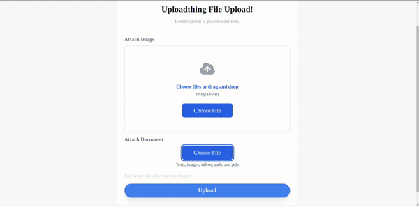 After a successful upload, visit your UploadThing dashboard. Navigate to Files, and you will see all the uploaded PDFs.
Displaying files from UploadThing
Because we have uploaded the files to our UploadThing server, let’s look at how we can render the uploaded files from the server into our application.
UploadThing provides a server-side SDK (UTApi) that can fetch file information from the server and render it on the application UI. It allows you to upload files, rename them, delete them, and more. The UTApi SDK simplifies interactions with UploadThing's API, allowing seamless file management within your application.
To use the UploadThing SDK, we will need to initialize an instance of UTApi. In the root folder, create a new file called server/uploadthing.ts and copy and paste the following code:
// server/uploadthing.ts
import { UTApi } from "uploadthing/server";

export const utapi = new UTApi({
    apiKey: process.env.UPLOADTHING_SECRET, // YOUR UPLOADTHING_SECRET
});
Replace the apiKey with your UploadThing secret from your dashboard. With this, we can import and use UTApi anywhere in our project.
Now we will create a reusable client component that will render the list of files based on the provided data prop:
// components/Files.tsx
"use client"
import React from "react";

export default function Files({ data }: any) {
  return (
    <>
      {data.length > 0 && (
        <ul>
          {data.map((file: any) => (
            <li key={file.id}>
              <a href={file.key} target="_blank" rel="noreferrer">
                {file.name}
              </a>
            </li>
          ))}
        </ul>
      )}
    </>
  );
}
This component iterates through the data, creates list items, and displays file names as links.
We will then create a file that fetches a list of uploaded files from UploadThing using the UTApi object. In the app folder, create a new files/pages.tsx file, and then copy and paste the code below:
// app/files/page.tsx
import React from 'react'
import Files from '@/components/Files'
import { utapi } from '@/server/uploadthing';

async function getFiles() {
  const res = await utapi.listFiles();
  return res;
}

const files = async () => {
  const data = await getFiles();
  return (
   <main className="h-fit flex items-center justify-center bg-gray-50 py-12 px-4 sm:px-6 lg:px-8">
      <div className="sm:max-w-lg w-full p-5 bg-white rounded-xl">
        <Files
          data={data}
        />
      </div>
    </main>
  )
}
export default files;
Here, we imported the UTApi object from the server directory, which provides access to UploadThing's server-side functionality. Then we defined an asynchronous function named getFiles that uses the UTApi object to call the listFiles method. listFiles contains an array of objects representing the uploaded files.
We also used the imported Files component and passed the fetched data (a list of files) as a prop. Now run the development, go to your browser, and navigate to /files to see the result.
Deleting files from UploadThing
Next, let’s look at how to integrate a file deletion functionality into the application using the UploadThing server-side API and the UTApi object. Modify the Files component to handle file deletion requests:
export default function Files({ data, handleDelete }: any) {
  return (
    <>
      {data.length > 0 && (
        <ul>
          {data.map((file: any) => (
              // rest of the code
              <button onClick={() => handleDelete(file.key)}>Delete</button>
            </li>
          ))}
        </ul>
      )}
    </>
  );
}
The Files component now includes a new prop called handleDelete, which handles deletion logic. A button element with an onClick handler is added to the map function, which calls the handleDelete prop with the file's key.
Now let’s update the file/pages.tsx file with the necessary code to handle file deletions using the UTApi object:
// rest of the code

async function deleteFiles(fileKey: any) {
  const res = await utapi.deleteFiles(fileKey);
  return res;
}

const files = async () => {
// rest of the code

  const handleDelete = async (fileKey: any) => {
    "use server"
    await deleteFiles(fileKey);
    // Refresh data after deletion
    const newData = await getFiles();
    return newData;
  }
  return (
    <div>
      <Files
        data={data}
        handleDelete={handleDelete}
      />
    </div>
  )
}
Here we defined an asynchronous function named handleDelete that accepts the fileKey as an argument. The use server comment indicates that this function should execute on the server side. This is important because updating data on the client side would throw an error and wouldn’t reflect the current state on UploadThing's servers.
To begin deleting, we use the previously created deleteFiles function from within handleDelete. After deletion, we call the getFiles function again to fetch the updated list of files from UploadThing, which returns the newly fetched data (newData).
Advanced features
Now, let’s look at some advanced features that UploadThing offers:
Theming
We can customize our custom component using UploadThing’s theming props (className and appearance):
<UploadDropzone
  endpoint={"productImage"}
  onClientUploadComplete={(res: any) => {
    console.log("files", res);
    setImageData(res?.[0].url);
    window.alert("Upload completed");
  }}
  onUploadError={(error) => {
    window.alert(`${error?.message}`);
  }}
  className="mt-4 ut-button:bg-red-500 ut-button:ut-readying:bg-red-500/50"
/>
ut-button applies styles to the button and ut-button:ut-readying applies styles when the button is loading, while styles without ut prefixes apply to the container:  You can also customize the UploadThing container, label, and allowed content to fit your design style and improve user experience:
<UploadDropzone className="bg-slate-800 ut-label:text-lg ut-allowed-content:ut-uploading:text-red-300"
/>
 Add the styles below the
 UploadDropzone className prop:
bg-slate-800 ut-label:text-lg ut-label:text-white ut-allowed-content:ut-uploading:text-red-300
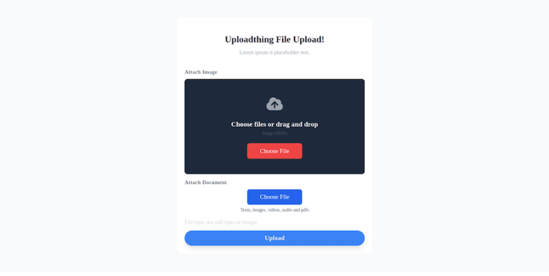 The
The appearance prop can be used to target different elements of a component without using the withUt wrapper or splitting styles. This will produce the same result as the examples above using className:
<UploadDropzone
  appearance={{
    button: "bg-red-500 ut-button:ut-ready:bg-red-500/50",
    container:
      "bg-slate-800 ut-label:text-lg ut-label:text-white ut-allowed-content:ut-uploading:text-red-300",
  }}
/>
Multiple file upload
Managing the upload of multiple files is a common requirement for many applications. UploadThing allows you to add this functionality to your Next.js projects easily. Let’s implement a custom multiple-file upload using some of UploadThing's built-in hooks.
First, copy and paste the following code to your utils/uploadthing.ts file:
import { generateReactHelpers } from "@uploadthing/react";

export const { useUploadThing } = generateReactHelpers<OurFileRouter>();
This code snippet creates a custom React Hook called useUploadThing. This hook offers functions for uploading, isUploading state, and permittedFileInfo, which provides details about the endpoint's allowed file types, sizes, and counts. The generateReactHelpers function generates helper hooks specifically designed for integrating UploadThing functionalities. Now, in your root folder, create a new file called components/MulitUploader.tsx and add the code below:
"use client";
import { useCallback, useState } from "react";
import { useUploadThing } from "@/utils/uploadthing";
import { useDropzone } from "@uploadthing/react";
import { generateClientDropzoneAccept } from "uploadthing/client";

export function MultiUploader() {
  const [files, setFiles] = useState<File[]>([]);

  const onDrop = useCallback((acceptedFiles: File[]) => {
    setFiles(acceptedFiles);
  }, []);

  const { startUpload, permittedFileInfo } = useUploadThing("productImage", {
    onClientUploadComplete: () => {
      alert("uploaded successfully!");
    },
    onUploadError: () => {
      alert("error occurred while uploading");
    },
    onUploadBegin: () => {
      alert("upload has begun");
    },
  });

  const fileTypes = permittedFileInfo?.config
    ? Object.keys(permittedFileInfo?.config)
    : [];

  const { getRootProps, getInputProps } = useDropzone({
    onDrop,
    accept: fileTypes ? generateClientDropzoneAccept(fileTypes) : undefined,
  });

  return (
    <div {...getRootProps()}>
      <input {...getInputProps()} />
      <div className="flex items-center justify-center h-48 border-2 border-gray-300 border-dashed rounded-md flex-col">
        Drop files here!
        {files.length > 0 && (
          <button
            type="button"
            className="p-2 bg-blue-500 text-white rounded"
            onClick={() => startUpload(files)}
          >
            Upload {files.length} files
          </button>
        )}
      </div>
    </div>
  );
}
This code snippet creates a custom multiple-file uploader that leverages some of UploadThing’s hooks. The useDropZone Hook creates drag-and-drop file upload interfaces and the generateClientDropzoneAccept function generates the accept attribute for dropzones, ensuring browser-level file validation.
The MultiUploader component stores selected files, handles upload configuration, and triggers a startUpload function upon selection, extracting file types from permittedFileInfo: 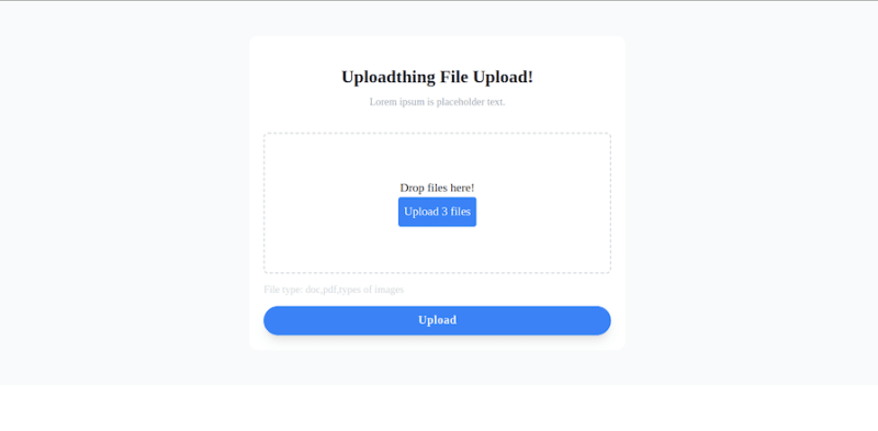
Using the UploadThing SSR plugin for server-side rendering
UploadThing offers a plugin that uses server-provided information to determine if a user has the necessary permissions to upload specific file types or perform specific actions. This information enforces restrictions to provide a secure upload environment.
UploadThing typically enters a "loading state" when retrieving permission information, which may include visual cues like a loading indicator. The plugin could allow users to configure UploadThing to assume certain permissions based on their application logic, potentially improving performance by avoiding the loading state.
To avoid the loading state in SSR hydration, UploadThing offers a hydration helper that can be rendered in your root layout before the children:
// app/layout.tsx
import "./globals.css";
import { NextSSRPlugin } from "@uploadthing/react/next-ssr-plugin";
import { extractRouterConfig } from "uploadthing/server";
import { ourFileRouter } from "./api/uploadthing/core";

export default function RootLayout({
  children,
}: Readonly<{
  children: React.ReactNode;
}>) {
  return (
    <html lang="en">
      <body>
        <NextSSRPlugin
          /**
           * The `extractRouterConfig` will extract **only** the route configs
           * from the router to prevent additional information from being
           * leaked to the client. The data passed to the client is the same
           * as if you were to fetch `/api/uploadthing` directly.
           */
          routerConfig={extractRouterConfig(ourFileRouter)}
        />
        {children}
      </body>
    </html>
  );
}
However, bypassing server permission calls may introduce security risks if not implemented carefully. Ensuring application logic accurately determines the right permissions without relying on server verification is crucial.
Uploading images/files with UploadThing and the Shadcn form
Now let’s combine UploadThing and Shadcn form components to create a user interface for uploading files. We know that UploadThing streamlines the file upload process, while Shadcn offers a set of reusable UI components for creating forms.
To install and set up Shadcn in our application, run the following command on your terminal:
npx shadcn-ui@latest init
You will be asked a few questions to configure components.json:
Which style would you like to use? › Default
Which color would you like to use as base color? › Slate
Do you want to use CSS variables for colors? › no / yes
Now start adding Shadcn components to your project:
npx shadcn-ui@latest add button form input
The command above will add the Button, Form, and Input components to our project, which we can use to customize our form.
Importing necessary modules
To begin creating the form, we will create a new file named CustomForm inside the component folder and import the necessary React modules and components:
import React from 'react';
import { z } from 'zod';
import { useForm } from 'react-hook-form';
import { zodResolver } from '@hookform/resolvers/zod';
import { Form, FormControl, FormDescription, FormField, FormItem, FormLabel, FormMessage } from './ui/form';
import { Button } from './ui/button';
import { Input } from './ui/input';
import { useUploadThing } from '@/utils/uploadthing';
These imports lay the groundwork for creating a form component that looks attractive and functional, with built-in validation.
Form schema definition
The Shadcn form component is wrapped around the React Hook Form library and it also supports form validation with validation libraries like Zod. The form schema here uses Zod to specify the intended structure and data types of the form data:
const formSchema = z.object({
  file: z.any(),
});
This schema is straightforward. Schema validation is not the focus of this article, which is why we used any() in our file field. This should be enough to demonstrate file upload functionality without complicating validation logic.
Creating the CustomForm component
Inside the CustomForm function, we can use the useUploadThing Hook to handle file uploads:
const CustomForm = () => {
    const $ut = useUploadThing("productImage",{
        onClientUploadComplete: () => {
            alert("uploaded successfully!");
        },
    });
    const form = useForm<z.infer<typeof formSchema>>({
        resolver: zodResolver(formSchema),
        defaultValues: {
            file: [],
        },
    });
The hook takes two arguments: an endpoint, productImage, that we described earlier in this article, and a callback function that gets called when the upload finishes successfully on the client side. The useForm Hook from react-hook-form handles the form state and connects easily with Zod via the zodResolver to execute formSchema validation.
Implementing the Form UI
Now, let’s define the reusable form UI from Shadcn before implementing the form submission:
<FormField
  control={form.control}
  name="file"
  render={({ field: { value, onChange, ...fieldProps } }) => (
    <FormItem>
      <FormLabel>Username</FormLabel>
      <FormControl>
        <Input
          placeholder="Select file"
          type="file"
          {...fieldProps}
          multiple
          onChange={(event) =>
            onChange(event.target.files && event.target.files[0])
          }
        />
      </FormControl>
      <FormDescription>
        This is your public display name.
      </FormDescription>
      <FormMessage />
    </FormItem>
  )}
/>
Handling form submission
Now, let’s work on our form submission function. We will leverage the startUpload function from UploadThing:
async function onSubmit(values: z.infer<typeof formSchema>) {
    const selectedFiles = Array.from(values.file);
    const result = await $ut.startUpload(selectedFiles as File[]);
    return result;
}
Here, the function extracts the uploaded files from the form data, the Array.from function converts the file field to an array, triggering the upload process using the useUploadThing Hook, and returns the result.
Conclusion
This article explored how UploadThing empowers us to streamline file uploads within a demo Next.js application. From user-friendly UI components to comprehensive configuration options and server-side rendering support, UploadThing provides a great solution for handling various file upload cases.
Following this tutorial, you can enhance your application's file upload capabilities, ensuring a seamless and effective user experience. Check out the UploadThing examples and documentation for more information.
LogRocket: Full visibility into production Next.js apps
Debugging Next applications can be difficult, especially when users experience issues that are difficult to reproduce. If you’re interested in monitoring and tracking state, automatically surfacing JavaScript errors, and tracking slow network requests and component load time, try LogRocket.

LogRocket is like a DVR for web and mobile apps, recording literally everything that happens on your Next.js app. Instead of guessing why problems happen, you can aggregate and report on what state your application was in when an issue occurred. LogRocket also monitors your app's performance, reporting with metrics like client CPU load, client memory usage, and more.
The LogRocket Redux middleware package adds an extra layer of visibility into your user sessions. LogRocket logs all actions and state from your Redux stores.
Modernize how you debug your Next.js apps — start monitoring for free.


Top comments (0)