
Written by Rahul Padalkar✏️
PocketBase is an open source package that developers can leverage to spin up a backend for their SaaS and mobile applications. It’s written in Go, so it’s more performant under heavy loads compared to Node.js.
You can use PocketBase to build full-stack applications quickly — it provides many essential features out of the box, saving a lot of developer time and effort. In this tutorial-style post, let’s take a look at how we can leverage the power of PocketBase to build a forum-like web application.
You can find the code for our demo project here and follow along.
Overview of PocketBase and our demo app
PocketBase provides many benefits to developers working on full-stack apps. For example, it:
- Supports 15+ OAuth2 providers, including Google, Apple, Facebook, GitHub, and more
- Provides a real-time database with support for subscriptions
- Is extensible. We can intercept methods and run custom business logic in JavaScript or Go
- Provides a Dart and JavaScript SDK, so it can be integrated into Flutter or React Native applications along with web applications
- Provides an admin dashboard out of the box for managing and monitoring the backend
- Supports file storage without writing any extra code
We’ll see these benefits and more in action as we build our demo app. In our forum application, users will be able to:
- Join using their GitHub accounts
- Post their thoughts
- Comment on other posts
- Update or delete their own comments and posts
- Receive notifications when someone comments on their post
Let’s dive into our tutorial.
Setting up PocketBase
PocketBase is distributed as an executable for all major operating systems. Setting it up is very easy. Head to the PocketBase docs and download the executable for the OS that you’re on. It will download a zip file, which you must unzip to access the executable:  Run the executable with the following command:
./pocketbase serve
This command will start PocketBase. You should see this printed in the terminal window: 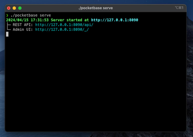 We will explore the Admin UI in the later sections of this post.
Creating a GitHub application
We’ll be using GitHub OAuth2 to onboard users onto our forum. To integrate GitHub OAuth2, we first need to create a OAuth application. Head over to GitHub’s Developer Settings (you must be logged in to GitHub) and click on OAuth Apps on the sidebar: 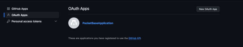 Then, click the New OAuth App button (or the Register a new application button, if you’ve never created an OAuth app before) and fill in the form:
 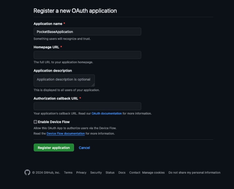 In the Authorization callback URL field, paste in the following:
http://127.0.0.1:8090/api/oauth2-redirect
You can provide any URL you’d like in the Homepage URL field. You should paste your application's web address if you’re developing a real application that uses GitHub OAuth2.
Once you’ve filled out all the required fields, click on the Register application button. Then, open the application and copy the client ID and client secret. We’ll need these values to enable GitHub as an OAuth2 provider in the PocketBase Admin UI.
Remember that the client secret is only visible once, so make sure to copy it somewhere safe.
Configuring PocketBase for Github OAuth2
Open the PocketBase Admin UI by visiting http://127.0.0.1:8090/_/.
You need to create an admin account when using the Admin UI for the first time. Once you’ve created your admin account, log in with your admin credentials, head over to Settings, and click on Auth providers. From the list, select GitHub, add the Client ID and Client secret, and hit Save: 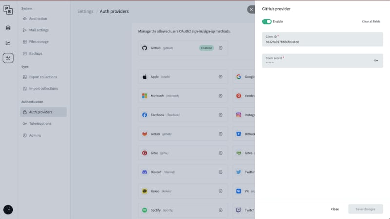 PocketBase is now configured for GitHub OAuth2.
Creating and setting up a React project
Now that we have successfully set up PocketBase and our GitHub application, let’s create a React project. We will use Vite to bootstrap our React project. Run this command:
npm create vite@latest forum-pocketbase --template react-ts
Follow the prompts. Once the app has been created, cd into the project directory and run this command:
cd forum-pocketbase
npm i
This will install all packages described in package.json. Now, let’s install Chakra UI:
npm i @chakra-ui/react @emotion/react @emotion/styled framer-motion
Followed by installing react-router-dom and its dependencies:
npm install react-router-dom localforage match-sorter sort-by
Once installed, open main.tsx and add the following code:
/* ./src/main.tsx */
import React from "react";
import ReactDOM from "react-dom/client";
import "./index.css";
import { createBrowserRouter, RouterProvider } from "react-router-dom";
import { ChakraProvider, Flex } from "@chakra-ui/react";
import Join from "./routes/Join"; // We will define this later
import Home from "./routes/Home"; // We will define this later
import PrivateRoute from "./routes/PrivateRoute"; // We will define this later
const router = createBrowserRouter([
  {
    path: "/join",
    element: <Join />,
  },
  {
    path: "/",
    element: <PrivateRoute />,
    children: [
      {
        index: true,
        element: <Home />,
      },
    ],
  },
]);
ReactDOM.createRoot(document.getElementById("root")!).render(
  <ChakraProvider>
    <Flex flexDirection="column" paddingX="80" paddingY="10" h="100%">
      <RouterProvider router={router} />
    </Flex>
  </ChakraProvider>
);
There are two things to note in the code above.
First, we wrap our application in ChakraProvider component. This is a required step in setting up Chakra UI.
Then, we nest the RouterProvider component from React Router inside the ChakraProvider component. The RouteProvider takes the router as its input and helps with client-side routing.
React Router provides various routers — here, we’re using the browser router. We’ve defined two routes in the router config: a / root route and a /join route. We will define the corresponding components later.
Creating tables in PocketBase’s Admin UI
Now that we have set up React and PocketBase, let's create the necessary tables using the Admin UI. We will add two tables — a Posts table and a Comments table: 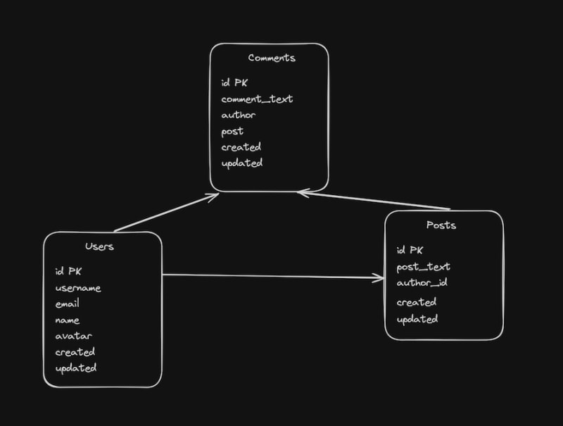 The
The Posts table will store all the posts made by members. The Comments table will store all the comments made on a post. The Users table is created by PocketBase out of the box.
Navigate to http://127.0.0.1:8090/_/ and log in with your admin credentials. Click on the Collections icon in the sidebar and click on the New collection button: 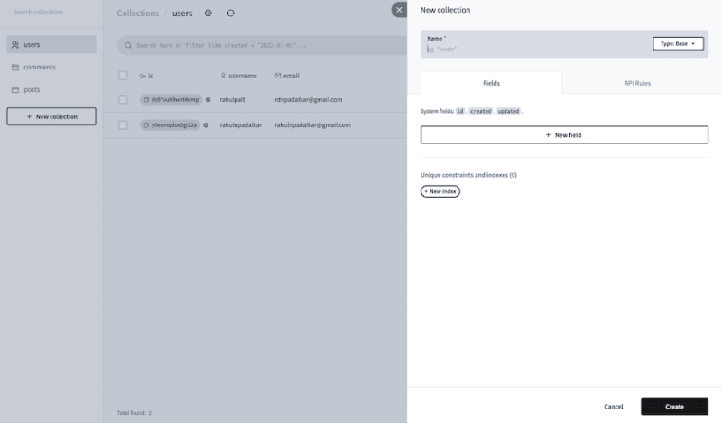 Create two collections:
 posts and comments.
The posts collection should have these fields:
-
post_textwith its type set asPlain Text; make itnon-empty -
author_idwith its type set asRelation; selectSingleand theUserscollection from the dropdown. This relation means only one user can be associated with one post - PocketBase also automatically sets up and populates some other fields, such as
id,created, andupdated
The comments collection should have these fields:
-
comment_textwith its type set asPlain Text; make itnon-empty -
authorwith its type set asRelation; selectSingleand theUserscollection from the dropdown -
postwith its type set asRelation; selectSingleand thePostscollection from the respective dropdown
This is how the two collections should look after the configuration described above. First, the comments collection: 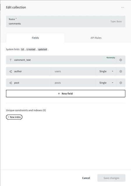 Next, the
 posts collection: 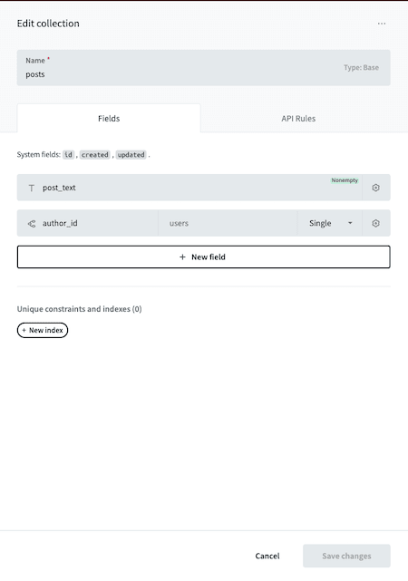
Setting up access control in PocketBase
With the collections all set up, let’s tweak the access control rules. These rules define who can access the data stored in a collection, as well as how they can do so. By default, all CRUD operations on a collection are admin-only.
To set up access control, click on the gear icon next to the collection name and click on the API Rules tab:  These are the access rules for the three collections. First, the
 posts collection access rules: 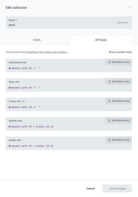 Next, the
 comments collection access rules: 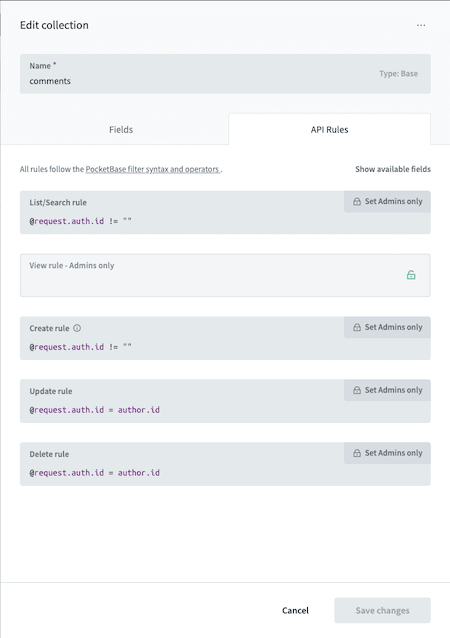 Finally, the
 users collection access rules: 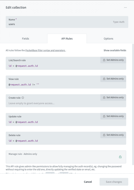 We’ve defined two kinds of rules here. This rule allows only registered and logged-in users to perform any action:
@request.auth.id != ""
While this rule allows only the user who created that record to perform any action on it:
@request.auth.id = author_id.id // defined for posts collection
@request.auth.id = author.id  // defined for comments collection
id = @request.auth.id // defined users collection
PocketBase allows developers to set complex access control rules, with more than 15 operators available for you to define those access control rules according to your needs.
Accessing PocketBase in our app
PocketBase ships with a JavaScript SDK that we can use for seamless communication with the PocketBase server. To install the SDK, run this command:
npm i pocketbase
Once the SDK is installed, let’s create a utility that we can call in our React components to access PocketBase easily:
// ./src/pocketbaseUtils.ts
import PocketBase from "pocketbase";
const pb = new PocketBase(import.meta.env.VITE_POCKETBASE_URL);
export function checkIfLoggedIn(): boolean {
  return pb.authStore.isValid;
}
export async function initiateSignUp() {
  await pb.collection("users").authWithOAuth2({ provider: "github" });
}
export function logout() {
  pb.authStore.clear();
}
export function getPb() {
  return pb;
}
This utility is handy for accessing the PocketBase instance from anywhere in our app. It also ensures that we make a single connection to the PocketBase server. We describe four functions in the utility above:
-
checkIfLoggedIn: Tells the caller if the user is logged in. It looks at theisValidproperty on theauthStoreon the PocketBase instance -
initiateSignUp: Initiates sign-in with GitHub. It calls theauthWithOAuth2method, to which we pass the OAuth2 provider. The callbacks, acknowledgments, and tokens are all handled by PocketBase -
logout: Clears the auth info from theauthStoreand logs the user out -
getPb: A getter method that returns the PocketBase instance to the caller
Adding a login screen to our PocketBase app
In this section, we’ll implement a login screen that will look like the below: 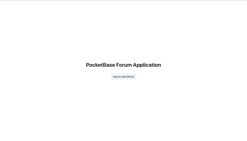 Here’s the code we’ll use to accomplish this feature:
/* ./src/routes/Join.tsx */
import { Button, Flex, Heading } from "@chakra-ui/react";
import { initiateSignUp } from "../pocketbaseUtils";
import { useNavigate } from "react-router-dom";
function Join() {
  const navigate = useNavigate();
  async function join() {
    await initiateSignUp();
    navigate("/");
  }
  return (
    <>
      <Flex
        direction="column"
        alignItems="center"
        height="100%"
        justifyContent="center"
      >
        <Heading>PocketBase Forum Application</Heading>
        <Flex justifyContent="space-evenly" width="20%" marginTop="10">
          <Button onClick={join}>Sign In with Github</Button>
        </Flex>
      </Flex>
    </>
  );
}
export default Join;
The <Join/> component here allows users to log into our forum application with their GitHub account. The Join component is mounted on the /join path as configured in the react-router config in the previous steps.
One thing to note is the join function that gets called when the Sign In with GitHub button is clicked. This calls the join function which in turn calls the initiateSignUp function from pocketbaseUtils.
Adding posts to the homepage
Before we start building our UI components, let’s take a look at how the components are structured:  We have defined two routes in the React Router config: the root
 / route and the /join route.
On the root / route, we will load the Home component. The / route is protected or private — i.e., it should only be accessible to logged-in users. So, we add it as a child of the <PrivateRoute> component in the React Router config.
We will take a quick look at the PrivateRoute component first
// ./src/routes/PrivateRoute.tsx

import { Navigate, Outlet } from "react-router-dom";
import { checkIfLoggedIn } from "../pocketbaseUitl";
const PrivateRoute = () => {
  return checkIfLoggedIn() ? <Outlet /> : <Navigate to="/join" />;
};
export default PrivateRoute;
This is a pretty straightforward component. It checks if the user is logged in. If yes, then the child component is rendered; if not, then the user is navigated to the /join route.
Now let’s take a look at the Home component that we render if the user is logged in:
/* ./src/routes/Home.tsx */

import { Flex } from "@chakra-ui/react";
import { useEffect, useState } from "react";
import { getPb } from "../pocketbaseUitl";
import { Post } from "../components/Post";
import { RawPost } from "../types";
import { convertItemsToRawPost } from "../utils";
import { SubmitPost } from "../components/SubmitPost";
import { Navigation } from "../components/navigation";

const Home = () => {
  const [posts, setPosts] = useState<RawPost[]>([]);

  useEffect(() => {
    getPosts();
  }, []);
  async function getPosts() {
    const pb = getPb();
    const { items } = await pb
      .collection("posts")
      .getList(1, 20, { expand: "author_id" });
    const posts: RawPost[] = convertItemsToRawPost(items);
    setPosts(posts);
  }
  return (
    <Flex direction="column">
      <Navigation />
      <SubmitPost onSubmit={getPosts} />
      {posts?.map((p) => (
        <Post post={p} key={p.id} openComments={openCommentsModal} />
      ))}
    </Flex>
  );
};
export default Home;
In the code above, we get the PocketBase instance from the utility function. Then, we get a list of posts along with the author details.
The getList function has pagination built in. Here, we’re fetching page 1 with 20 records per page. We use the expand option from PocketBase to get the related tables data — in this case the users table.
We have introduced three new components here:
-
Post: For displaying posts submitted by members of the forum -
SubmitPost: For submitting aPost -
Navigation: For navigating around the app. We will take a look at this component later
Here’s a demo of how the Post and SubmitPost components would work together: 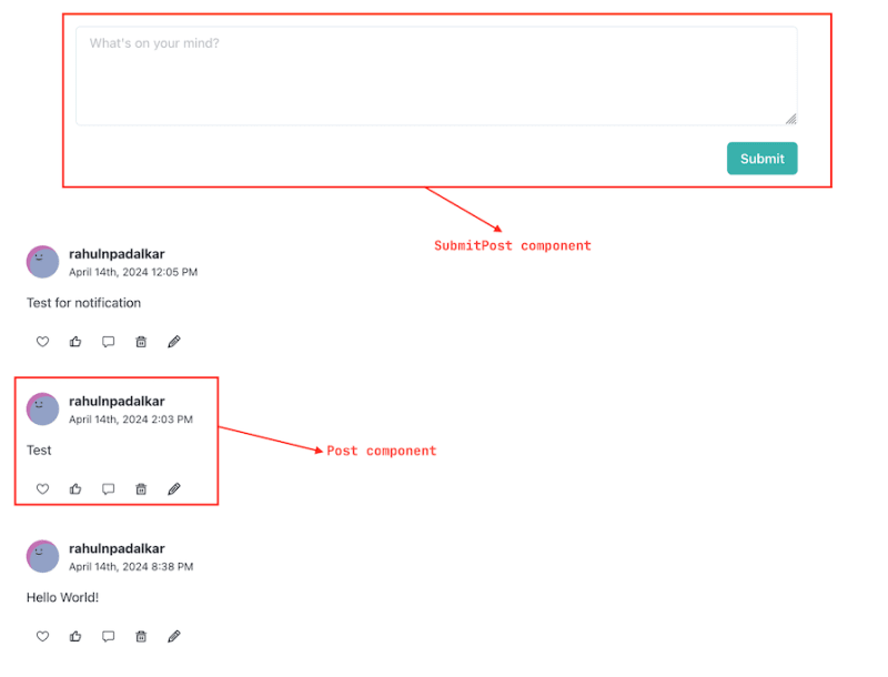 Let’s quickly take a look at the
 Post component:
/* ./src/components/Post.tsx */
import {
  Flex,
  IconButton,
  Image,
  Text,
  Textarea,
  useToast,
} from "@chakra-ui/react";
import { RawPost } from "../types";
import { GoHeart, GoComment } from "react-icons/go";
import { format } from "date-fns";
import { BiLike } from "react-icons/bi";
import { RiDeleteBin5Line, RiCheckFill } from "react-icons/ri";
import { getPb } from "../pocketbaseUitl";
import { GrEdit } from "react-icons/gr";
import { GiCancel } from "react-icons/gi";
import { useState } from "react";
const pb = getPb();
export const Post = ({
  post,
}: {
  post: RawPost;
}) => {
  const [updateMode, setUpdateMode] = useState<boolean>(false);
  const [updatedPostText, setUpdatedPostText] = useState<string>(
    post.post_text
  );
  const toast = useToast();
  async function deletePost() {
    try {
      await pb.collection("posts").delete(post.id);
      toast({
        title: "Post deleted",
        description: "Post deleted successfully.",
        status: "success",
      });
    } catch (e) {
      toast({
        title: "Post deletion failed",
        description: "Couldn't delete the post. Something went wrong.",
        status: "error",
      });
    }
  }
  async function updatePost() {
    try {
      await pb
        .collection("posts")
        .update(post.id, { post_text: updatedPostText });
      toast({
        title: "Post updated",
        description: "Post updated successfully.",
        status: "success",
      });
      setUpdateMode(false);
    } catch (e) {
      toast({
        title: "Post updation failed",
        description: "Couldn't update the post. Something went wrong.",
        status: "error",
      });
    }
  }
  return (
    <Flex flexDirection="column" margin="5">
      <Flex flexDirection="column">
        <Flex alignItems="center">
          <Image
            src={`https://source.boringavatars.com/beam/120/${post.author.username}`}
            height="10"
            marginRight="3"
          />
          <Flex flexDirection="column">
            <Text fontWeight="bold">{post.author.username}</Text>
            <Text fontSize="13">{format(post.created, "PPP p")}</Text>
          </Flex>
        </Flex>
      </Flex>
      <Flex marginY="4">
        {updateMode ? (
          <Flex flexDirection="column" flex={1}>
            <Textarea
              value={updatedPostText}
              onChange={(e) => setUpdatedPostText(e.target.value)}
              rows={2}
            />
            <Flex flexDirection="row" marginTop="2" gap="3">
              <IconButton
                icon={<RiCheckFill />}
                aria-label="submit"
                backgroundColor="green.400"
                color="white"
                size="sm"
                onClick={updatePost}
              />
              <IconButton
                icon={<GiCancel />}
                aria-label="cross"
                backgroundColor="red.400"
                color="white"
                size="sm"
                onClick={() => {
                  setUpdateMode(false);
                }}
              />
            </Flex>
          </Flex>
        ) : (
          <Text>{post.post_text}</Text>
        )}
      </Flex>
      <Flex>
        <Flex>
          <IconButton
            icon={<GoHeart />}
            aria-label="love"
            background="transparent"
          />
          <IconButton
            icon={<BiLike />}
            aria-label="like"
            background="transparent"
          />
          {post.author_id === pb.authStore.model!.id && (
            <>
              <IconButton
                icon={<RiDeleteBin5Line />}
                aria-label="delete"
                background="transparent"
                onClick={deletePost}
              />
              <IconButton
                icon={<GrEdit />}
                aria-label="edit"
                background="transparent"
                onClick={() => setUpdateMode(true)}
              />
            </>
          )}
        </Flex>
      </Flex>
    </Flex>
  );
};
Although this code block is quite long, if you take a closer look, you’ll see that it’s actually a fairly simple React component.
This Post component allows us to display post details and lets the user edit and delete their posts, or interact with using "love" and "like" icons. It also uses toast notifications to alert the user upon successful or failed post deletions and updates.
There are three things to note here. First, the code block on line number 32 uses the delete function from the collection to delete the post whose id is passed to the function:
await pb.collection("posts").delete(post.id);
Second, the code block on line numbers 48-50 uses the update function on the collection. The first argument is the id of the post that needs to be updated and the second argument is the update object. Here, we’re updating the post text:
await pb.collection("posts").update(post.id, { post_text: updatedPostText });
Finally, the code block on line 125 allows for conditional rendering of the action buttons:
post.author_id === pb.authStore.model!.id
This condition allows the owner of the post to either delete or update it. Even if a malicious user somehow bypasses this check, they won’t be able to delete or update the post because of the access rules we set earlier.
Now, let’s briefly take a look at the SubmitPost component:
import { Button, Flex, Textarea } from "@chakra-ui/react";
import { useState } from "react";
import { getPb } from "../pocketbaseUitl";
import { useToast } from "@chakra-ui/react";
export const SubmitPost = ({ onSubmit }: { onSubmit: () => void }) => {
  const [post, setPost] = useState("");
  const toast = useToast();
  const submitPost = async () => {
    const pb = getPb();
    try {
      await pb.collection("posts").create({
        post_text: post,
        author_id: pb.authStore.model!.id,
      });
      toast({
        title: "Post submitted.",
        description: "Post succesfully submitted",
        status: "success",
        duration: 7000,
      });
      onSubmit();
      setPost("");
    } catch (e: any) {
      toast({
        title: "Post submission failed",
        description: e["message"],
        status: "error",
      });
    }
  };
  return (
    <Flex flexDirection="column" paddingX="20" paddingY="10">
      <Textarea
        rows={4}
        placeholder="What's on your mind?"
        value={post}
        onChange={(e) => setPost(e.target.value)}
      />
      <Flex flexDirection="row-reverse" marginTop="5">
        <Button backgroundColor="teal.400" color="white" onClick={submitPost}>
          Submit
        </Button>
      </Flex>
    </Flex>
  );
};
As before, this is a simple React component that provides a text area in the UI for users to write and submit posts. Note that the code block on line 11 uses the create function on the collection to create a post with text and the author as the currently logged-in user:
await pb.collection("posts").create({
  post_text: post,
  author_id: pb.authStore.model!.id,
});
Adding comment functionality
What’s the use of posts if no one can comment on them? As a next step, let’s add a comment feature on posts to our forum application. Here’s how our comment functionality will look: 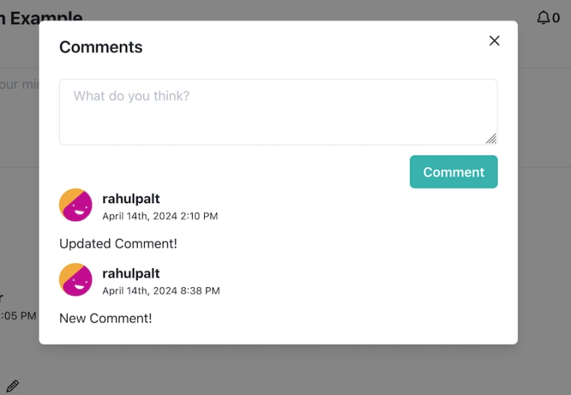 We’ll create a
 Comments component to set up the modal, while the individual comments will be Comment components.
To start, let’s modify the Home component:
import { Flex, useDisclosure } from "@chakra-ui/react";
import { useEffect, useState } from "react";
import { getPb } from "../pocketbaseUitl";
import { Post } from "../components/Post";
import { RawPost } from "../types";
import { convertItemsToRawPost } from "../utils";
import { SubmitPost } from "../components/SubmitPost";
import { Navigation } from "../components/navigation";
import Comments from "../components/Comments";
import NewPosts from "../components/NewPosts";
const Home = () => {
  const [posts, setPosts] = useState<RawPost[]>([]);
  const { isOpen, onOpen, onClose } = useDisclosure();
  const [openCommentsFor, setOpenCommentsFor] = useState("");
  const openCommentsModal = (postId: string) => {
    onOpen();
    setOpenCommentsFor(postId);
  };
  useEffect(() => {
    getPosts();
  }, []);
  async function getPosts() {
    const pb = getPb();
    const { items } = await pb
      .collection("posts")
      .getList(1, 20, { expand: "author_id" });
    const posts: RawPost[] = convertItemsToRawPost(items);
    setPosts(posts);
  }
  return (
    <Flex direction="column">
      <Navigation />
      <SubmitPost onSubmit={getPosts} />
      <NewPosts />
      {posts?.map((p) => (
        <Post post={p} key={p.id} openComments={openCommentsModal} />
      ))}
      {isOpen && (
        <Comments isOpen={isOpen} onClose={onClose} postId={openCommentsFor} />
      )}
    </Flex>
  );
};
export default Home;
Here we introduced a new component Comment that accepts the following props:
-
isOpen: For toggling the visibility of the comments modal -
onClose: A callback to execute when the comments modal is closed -
postId: To specify the post for which comments need to be shown
We also add a openComments prop to the Post component. We will modify the Post component next:
import {
  Flex,
  IconButton,
  Image,
  Text,
  Textarea,
  useToast,
} from "@chakra-ui/react";
import { RawPost } from "../types";
import { GoHeart, GoComment } from "react-icons/go";
import { format } from "date-fns";
import { BiLike } from "react-icons/bi";
import { RiDeleteBin5Line, RiCheckFill } from "react-icons/ri";
import { getPb } from "../pocketbaseUitl";
import { GrEdit } from "react-icons/gr";
import { GiCancel } from "react-icons/gi";
import { useState } from "react";
const pb = getPb();
export const Post = ({
  post,
  openComments,
}: {
  post: RawPost;
  openComments: (postId: string) => void;
}) => {
  const [updateMode, setUpdateMode] = useState<boolean>(false);
  const [updatedPostText, setUpdatedPostText] = useState<string>(
    post.post_text
  );
  const toast = useToast();
  async function deletePost() {
    try {
      await pb.collection("posts").delete(post.id);
      toast({
        title: "Post deleted",
        description: "Post deleted successfully.",
        status: "success",
      });
    } catch (e) {
      toast({
        title: "Post deletion failed",
        description: "Couldn't delete the post. Something went wrong.",
        status: "error",
      });
    }
  }
  async function updatePost() {
    try {
      await pb
        .collection("posts")
        .update(post.id, { post_text: updatedPostText });
      toast({
        title: "Post updated",
        description: "Post updated successfully.",
        status: "success",
      });
      setUpdateMode(false);
    } catch (e) {
      toast({
        title: "Post updation failed",
        description: "Couldn't update the post. Something went wrong.",
        status: "error",
      });
    }
  }
  return (
    <Flex flexDirection="column" margin="5">
      <Flex flexDirection="column">
        <Flex alignItems="center">
          <Image
            src={`https://source.boringavatars.com/beam/120/${post.author.username}`}
            height="10"
            marginRight="3"
          />
          <Flex flexDirection="column">
            <Text fontWeight="bold">{post.author.username}</Text>
            <Text fontSize="13">{format(post.created, "PPP p")}</Text>
          </Flex>
        </Flex>
      </Flex>
      <Flex marginY="4">
        {updateMode ? (
          <Flex flexDirection="column" flex={1}>
            <Textarea
              value={updatedPostText}
              onChange={(e) => setUpdatedPostText(e.target.value)}
              rows={2}
            />
            <Flex flexDirection="row" marginTop="2" gap="3">
              <IconButton
                icon={<RiCheckFill />}
                aria-label="submit"
                backgroundColor="green.400"
                color="white"
                size="sm"
                onClick={updatePost}
              />
              <IconButton
                icon={<GiCancel />}
                aria-label="cross"
                backgroundColor="red.400"
                color="white"
                size="sm"
                onClick={() => {
                  setUpdateMode(false);
                }}
              />
            </Flex>
          </Flex>
        ) : (
          <Text>{post.post_text}</Text>
        )}
      </Flex>
      <Flex>
        <Flex>
          <IconButton
            icon={<GoHeart />}
            aria-label="love"
            background="transparent"
          />
          <IconButton
            icon={<BiLike />}
            aria-label="like"
            background="transparent"
          />
          <IconButton
            icon={<GoComment />}
            aria-label="like"
            background="transparent"
            onClick={() => {
              openComments(post.id);
            }}
          />
          {post.author_id === pb.authStore.model!.id && (
            <>
              <IconButton
                icon={<RiDeleteBin5Line />}
                aria-label="delete"
                background="transparent"
                onClick={deletePost}
              />
              <IconButton
                icon={<GrEdit />}
                aria-label="edit"
                background="transparent"
                onClick={() => setUpdateMode(true)}
              />
            </>
          )}
        </Flex>
      </Flex>
    </Flex>
  );
};
Here’s a closer look at the update we made to our Post component on lines 126-133:
          <IconButton
            icon={<GoComment />}
            aria-label="like"
            background="transparent"
            onClick={() => {
              openComments(post.id);
            }}
          />
To summarize, we added a comment icon in the Post component. When a user clicks on this icon, the openComments method passed as a prop to the Post component is executed. This then opens the comment modal.
Now that we have set the trigger for opening the comments, let’s take a look at the Comments component:
/* ./src/components/Comments.tsx */
import {
  Flex,
  Textarea,
  Button,
  Modal,
  ModalOverlay,
  ModalContent,
  ModalHeader,
  ModalBody,
  ModalCloseButton,
  useToast,
} from "@chakra-ui/react";
import { useEffect, useState } from "react";
const pb = getPb();
import { getPb } from "../pocketbaseUitl";
import { convertItemsToComments } from "../utils";
import { RawComment } from "../types";
import Comment from "./Comment";

export default function Comments({
  isOpen,
  onClose,
  postId,
}: {
  isOpen: boolean;
  onClose: () => void;
  postId: string;
}) {
  const [comment, setComment] = useState<string>("");
  const [comments, setComments] = useState<RawComment[]>([]);

  const toast = useToast();

  const submitComment = async () => {
    try {
      await pb.collection("comments").create({
        comment_text: comment,
        author: pb.authStore.model!.id,
        post: postId,
      });
      loadComments();
      toast({
        title: "Comment Submitted",
        description: "Comment submitted successfully",
        status: "success",
      });
      setComment("");
    } catch (e) {
      toast({
        title: "Comment Submission",
        description: "Comment submission failed",
        status: "error",
      });
    }
  };

  async function loadComments() {
    const result = await pb
      .collection("comments")
      .getList(1, 10, { filter: `post="${postId}"`, expand: "author" });

    const comments = convertItemsToComments(result.items);
    setComments(comments);
  }

  useEffect(() => {
    loadComments();
  }, []);

  return (
    <Modal isOpen={isOpen} onClose={onClose} size="xl">
      <ModalOverlay />
      <ModalContent>
        <ModalHeader>Comments</ModalHeader>
        <ModalCloseButton />
        <ModalBody>
          <Flex flexDirection="column">
            <Flex flexDirection="column">
              <Textarea
                value={comment}
                onChange={(e) => setComment(e.target.value)}
                placeholder="What do you think?"
              />
              <Flex flexDirection="row-reverse">
                <Button
                  backgroundColor="teal.400"
                  color="white"
                  marginTop="3"
                  onClick={submitComment}
                >
                  Comment
                </Button>
              </Flex>
            </Flex>
            {comments.map((c) => (
              <Comment comment={c} key={c.id} loadComments={loadComments} />
            ))}
          </Flex>
        </ModalBody>
      </ModalContent>
    </Modal>
  );
}
Four things need to be noted here:
- To load the comments, we’ve defined a
loadCommentsfunction. Just like posts, we use thegetListfunction available on thecommentscollection. Similar to ourPostscomponent, we use theexpandoption to get information about the author of the comment. Additionally, we pass in a filter that filters comments bypostId - We call the
loadCommentsfunction inside theuseEffectHook - We have defined a
submitCommentfunction that creates a new comment in thecommentscollection. Upon successful submission of a comment, we call theloadCommentsfunction again to fetch all the comments made on the post - We use the
Commentcomponent to display comments in the modal. ThisCommentcomponent accepts the comment object, akeyto identify comments uniquely (required by React), and theloadCommentsfunction
Now, let's quickly take a look at the Comment component:
/* ./src/components/Comment.tsx */
import {
  Flex,
  IconButton,
  Image,
  Text,
  Textarea,
  useToast,
} from "@chakra-ui/react";
import { RawComment } from "../types";
import { format } from "date-fns";
import { useState } from "react";

import { GrEdit } from "react-icons/gr";
import { GiCancel } from "react-icons/gi";
import { RiDeleteBin5Line, RiCheckFill } from "react-icons/ri";
import { getPb } from "../pocketbaseUitl";

const pb = getPb();

export default function Comment({
  comment,
  loadComments,
}: {
  comment: RawComment;
  loadComments: () => void;
}) {
  const toast = useToast();

  const [updateMode, setUpdateMode] = useState<boolean>(false);
  const [updatedCommentText, setUpdatedCommentText] = useState<string>(
    comment.comment_text
  );

  async function deleteComment() {
    try {
      await pb.collection("comments").delete(comment.id);
      toast({
        title: "Comment deleted",
        description: "Comment deleted successfully.",
        status: "success",
      });
      loadComments();
    } catch (e) {
      toast({
        title: "Comment deletion failed",
        description: "Couldn't delete the comment. Something went wrong.",
        status: "error",
      });
    }
  }

  async function updateComment() {
    try {
      await pb
        .collection("comments")
        .update(comment.id, { comment_text: updatedCommentText });
      toast({
        title: "Comment updated",
        description: "Comment updated successfully.",
        status: "success",
      });
      loadComments();
      setUpdateMode(false);
    } catch (e) {
      toast({
        title: "Comment updation failed",
        description: "Couldn't update the comment. Something went wrong.",
        status: "error",
      });
    }
  }

  return (
    <Flex flexDirection="column">
      <Flex>
        <Image
          src={`https://source.boringavatars.com/beam/120/${comment.author.username}`}
          height="10"
          marginRight="3"
        />
        <Flex flexDirection="column">
          <Text fontWeight="bold">{comment.author.username}</Text>
          <Text fontSize="12">{format(comment.created, "PPP p")}</Text>
        </Flex>
      </Flex>
      <Flex>
        {updateMode ? (
          <Flex marginY="3" flex="1">
            <Textarea
              value={updatedCommentText}
              onChange={(e) => setUpdatedCommentText(e.target.value)}
              rows={1}
            />
            <Flex flexDirection="row" marginTop="2" gap="3">
              <IconButton
                icon={<RiCheckFill />}
                aria-label="submit"
                backgroundColor="green.400"
                color="white"
                size="sm"
                onClick={updateComment}
              />
              <IconButton
                icon={<GiCancel />}
                aria-label="cross"
                backgroundColor="red.400"
                color="white"
                size="sm"
                onClick={() => {
                  setUpdateMode(false);
                }}
              />
            </Flex>
          </Flex>
        ) : (
          <Flex marginY="3" flex="1">
            <Text>{comment.comment_text}</Text>
          </Flex>
        )}
        {comment.author.email === pb.authStore.model!.email && (
          <Flex flexDirection="row">
            <IconButton
              icon={<RiDeleteBin5Line />}
              aria-label="delete"
              backgroundColor="transparent"
              onClick={deleteComment}
            />
            <IconButton
              icon={<GrEdit />}
              aria-label="edit"
              backgroundColor="transparent"
              onClick={() => setUpdateMode(true)}
            />
          </Flex>
        )}
      </Flex>
    </Flex>
  );
}
This component is very similar to the Post component in terms of functionality. We use the delete and update functions on the comments collection to perform actions on the record. Also, we allow only the owner of the comment to perform these actions on the comment.
Adding a notification system
PocketBase offers out-of-the-box support for subscriptions. This allows users to listen to changes made to a collection. Let’s try to build a notification system with this feature, which we’ll add to our Navigation component:  Let’s try to add subscriptions to the
 navigation component. Whenever someone comments on a post made by the logged-in user, the notification counter in the nav bar increases by one:  Here’s the code for our
 navigation component, updated to include the notification feature:
/* ./src/components/navigation */
import { Flex, Text, Button, IconButton, Image } from "@chakra-ui/react";
import { getPb, logout } from "../pocketbaseUitl";
import { useNavigate } from "react-router-dom";
import { BiBell } from "react-icons/bi";
import { useEffect, useState } from "react";
const pb = getPb();
export const Navigation = () => {
  const navigate = useNavigate();
  const [notificationCount, setNotificationCount] = useState<number>(0);
  const logoutUser = () => {
    logout();
    navigate("/join");
  };
  useEffect(() => {
    pb.collection("comments").subscribe(
      "*",
      (e) => {
        if (e.record.expand?.post.author_id === pb.authStore.model!.id) {
          setNotificationCount(notificationCount + 1);
        }
      },
      { expand: "post" }
    );
    return () => {
      pb.collection("comments").unsubscribe();
    };
  }, []);
  return (
    <Flex direction="row" alignItems="center">
      <Text fontWeight="bold" flex="3" fontSize="22">
        PocketBase Forum Example
      </Text>
      <Flex>
        <Flex alignItems="center" marginX="5">
          <Button backgroundColor="transparent">
            <BiBell size="20" />
            {notificationCount && (
              <Flex
                borderRadius="20"
                background="red.500"
                p="2"
                marginLeft="2"
                height="60%"
                alignItems="center"
              >
                <Text color="white" fontSize="12">
                  {notificationCount}
                </Text>
              </Flex>
            )}
          </Button>
        </Flex>
        <Button onClick={logoutUser} colorScheme="red" color="white">
          Logout
        </Button>
        <Image
          marginLeft="5"
          height="10"
          src={`https://source.boringavatars.com/beam/120/${
            pb.authStore.model!.username
          }`}
        />
      </Flex>
    </Flex>
  );
};
The code below, which is on lines 15-28 above, is of particular interest to us:
  useEffect(() => {
    pb.collection("comments").subscribe(
      "*",
      (e) => {
        if (e.record.expand?.post.author_id === pb.authStore.model!.id) {
          setNotificationCount(notificationCount + 1);
        }
      },
      { expand: "post" }
    );
    return () => {
      pb.collection("comments").unsubscribe();
    };
  }, []);
We use the subscribe method on the collection to listen to changes made to the comments collection.
We want to show a notification when a new comment is added to a post made by the logged-in user. So, we subscribe to all the changes by passing in * as the first argument to the subscribe function.
When a new record gets added to the comments collection the server sends an event to all the subscribers with the newly created record as a payload. We check if the comment is made on a post authored by the logged-in user. If yes, we increment the notification counter and show it in the navigation bar.
We use the useEffect Hook with no dependencies to ensure that the client is subscribed only once and we dispose of the subscription when the component is unmounted.
Conclusion
If you’re trying to build an MVP or quickly test out a business idea to see if it has any legs, PocketBase can be a huge time and effort saver. Most of the features required to build an MVP — like authentication, file uploads, real-time subscriptions, and access control rules — are baked into the PocketBase framework.
Also, since PocketBase is Go-based, it performs better than Node.js under heavy loads. Overall, if you’re looking to move fast and experiment with some business ideas, PocketBase can help you do just that with minimal effort.
All the code for the tutorial is available here.
That’s it! Thank you for reading!


Top comments (0)