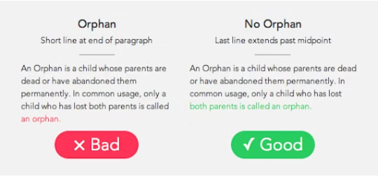
In the world of CSS, the handling of text within containers often requires careful consideration to maintain readability and aesthetics. Two lesser-known CSS properties, text-wrap: balance and text-wrap: pretty, offer intriguing solutions for text layout. Let's dive into these properties and understand their capabilities.
text-wrap: balance
Mainly use to balancing headlines text-wrap: balance attempts to distribute the text evenly across lines, reducing the unevenness often seen in standard text layouts.
Consider the following example:
.balanced {
  text-wrap: balance;
}
text-wrap: pretty
On the other hand, text-wrap: pretty will try to intelligently break the text in block elements in such a way that there wouldn’t be a single/orphan word on the last line.
Consider the following example:
p {
  text-wrap: pretty;
}
As for the browser support, the text-wrap: pretty is estimated to be landed in Chrome 117 across desktop and Android browsers.
(All images by developer.chrome.com)


Top comments (0)