When building Vue applications, components are the backbone of your UI. But what happens when you need a component that isn’t just reusable but also highly customizable? Enter Vue slots—a powerful feature that lets you define placeholders inside components, allowing you to pass in custom content while maintaining reusability.
Vue slots provide unmatched flexibility, making it easy to create dynamic, adaptable components. Whether you need to inject content into a modal, customize the layout of a card, or pass complex UI structures into child components, slots make it effortless. They also promote separation of concerns, ensuring that parent components control layout and logic while child components focus on rendering content.
In this article, we’ll explore:
✅ Named and scoped slots for advanced use cases
✅ Dynamics slot names
✅ Scoped slots with functions
By the end, you'll see how slots can help you write cleaner, more maintainable code while boosting the versatility of your components.
The code is hosted here so you can follow along. Let’s dive in!
Consider the UserList.vue component below:
<script setup>
import { onMounted, ref } from "vue";

const userList = ref([]);
const loading = ref(true);

async function fetchUsers(){
    try {
        const response = await fetch("https://randomuser.me/api/?results=10");
        const data = await response.json();
        userList.value = data.results;
    } catch (error) {
        console.error("Error fetching data: ", error);
    } finally {
        loading.value = false;
    }
}
onMounted(() => {
  setTimeout(() => {
    fetchUsers();
  }, 2000);
});
</script>
<template>
  <div>
    <slot name="title">Users</slot>
    <slot
      name="userlist"
      :list="userList"
      v-if="!loading && userList.length"
    >
      <ul class="userlist">
        <li v-for="item in userList" :key="item.email" class="list-item">
          <div>
            <img
              width="48"
              height="48"
              :src="item.picture.large"
              :alt="item.name.first + ' ' + item.name.last"
            />
            <div>
              <div>{{ item.name.first }}</div>
            </div>
          </div>
        </li>
      </ul>
    </slot>
    <slot v-if="loading" name="loading">Loading...</slot>
  </div>
</template>

<style scoped>
ul {
  list-style: none;
  display: flex;
  flex-direction: column;
  gap: 1em;
}
li.list-item > div {
  display: flex;
  gap: 1em;
}
li img {
  border-radius: 50%;
  width: 50px;
  height: 50px;
}</style>
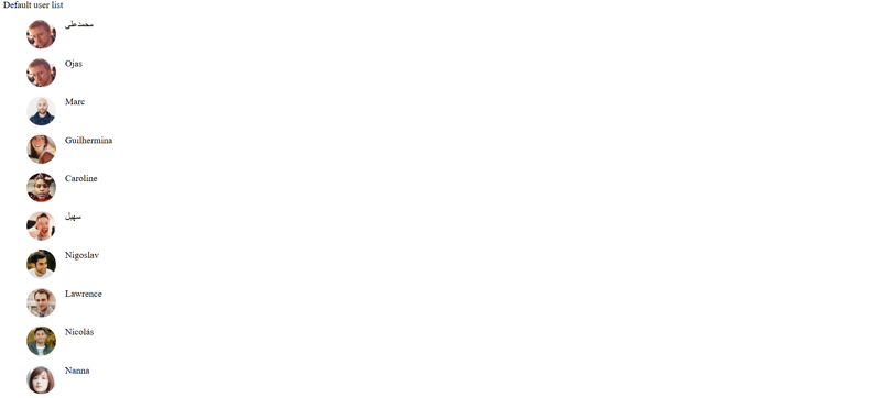
It's a simple component that fetches a list of users when it mounts. You can also see three main slots sections : title, userlist and loading. They all have fallback content, so rendering this component as it is is gonna look like:
App.vue
<script setup>
import UserList from "./components/UserList.vue";
</script>

<template>
  <UserList />
</template>
In the browser, you should see:
This is barely scratching the surface, for each slot sections, we can define new templates for them wherever needed. So we could change the title to be more descriptive or even insert a new component there. Let's go ahead and do that, let's also pass the number of users to the new title component:
Receive the count as a prop in ListTitle.vue:
<script setup>
const props = defineProps({
  count: Number,
});
</script>
<template>
  <section>
    <h1>My incredible list of {{ count }} users</h1>
  </section>
</template>

<style scoped>
section {
  background-color: #f0f0f0;
  padding: 20px;
  border-radius: 5px;
  margin: 20px 0;
}
h1 {
  color: #333;
}
</style>
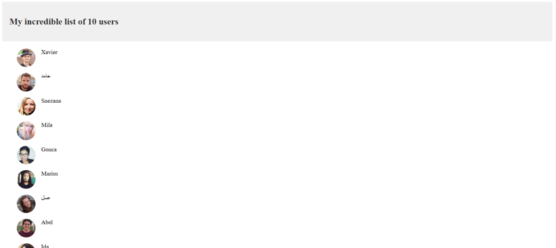
Assign the user list length to a variable from the title slot in UserList.vue
<slot name="title" :count="userList.length">Users</slot>
Then in App.vue, access the count variable from the slot and pass it as a prop to the ListTitle component like so :
<UserList>
    <template #title="{ count }">
      <ListTitle :count="count" />
    </template>
  </UserList>
In your browser, you should have:
Let's take it even further, let's modify UserList.vue. Add a remove function to remove users from the list:
function remove(item) {
  userList.value = userList.value.filter(
    (user) => user.login.uuid !== item.login.uuid
  );
}
Let's also modify the userlist slot to look like:
<slot
      name="userlist"
      :list="userList"
      :remove="remove"
      v-if="!loading && userList.length"
    >
      <ul class="userlist">
        <li v-for="item in userList" :key="item.email" class="list-item">
          <slot name="listitem" :user="item">
            <div>
              <img
                width="48"
                height="48"
                :src="item.picture.large"
                :alt="item.name.first + ' ' + item.name.last"
              />
              <div>
                <div>{{ item.name.first }}</div>
                <slot name="secondrow" :item="item"></slot>
              </div>
            </div>
          </slot>
        </li>
      </ul>
    </slot>
Notice we're now also passing the remove function to the slot data. Now we can access the list items and the function to remove items from the list as well. Let's see how we can implement that, let's create a new CardListComponent:
<script setup>
const { list } = defineProps({
  list: Array,
});
</script>
<template>
  <ul class="userlist">
    <li v-for="item in list" :key="item.email">
      <slot name="listitem" :user="item">
        <div class="card">
          <img
            class="resposive"
            :src="item.picture.large"
            :alt="item.name.first + ' ' + item.name.last"
          />
          <div class="card-body">
            <p>{{ item.name.first }} {{ item.name.first }}</p>
            <p>{{ item.email }}</p>
          </div>
        </div>
      </slot>
    </li>
  </ul>
</template>

<style scoped>
ul{
  list-style-type: none;
}
.userlist {
  display: grid;
  gap: 1rem;
  grid-template-columns: 1fr 1fr 1fr;
}

.resposive {
  width: 100%;
}

.card {
  box-shadow: 0 0 4px rgba(0, 0, 0, 0.25);
  border-radius: 4px;
  overflow: hidden;
}

.card-body {
  padding: 1rem;
}
</style>
In App.vue we now have access to the list array and remove function from the userlist slot. We can pass the list to the as a prop to the CardList component like so:
<UserList>
    <template #title="{ count }">
      <ListTitle :count="count" />
    </template>
    <template #userlist="{ list, remove }">
      <CardList :list="list"> </CardList>
    </template>
  </UserList>
Let's take it even further, let's modify the CardList.vue component to have slots and let's make it dynamic. So instead of just rendering the first name, last name and email of the user. let's add the ability to choose what to render using slots.
Modify the card body in CardList.vue to look like:
<div class="card-body">

            <slot name="first" :text="item.name.first"></slot>

            <slot name="last" :text="item.name.last"></slot>

            <slot name="full" :text="`${item.name.first} ${item.name.last}`"></slot>

            <slot name="fullWithTitle" :text="`${item.name.title} ${item.name.first} ${item.name.last}`"></slot>

            <slot name="secondrow" :item="item"></slot>
</div>
Now in App.vue, add a selected ref and options array and bind the value of selected to the slot name inside of the CardList.vue :
const selected = ref("first");

const options = [
  { value: "first", label: "First Name" },
  { value: "last", label: "Last Name" },
  { value: "full", label: "Full name" },
  { value: "fullWithTitle", label: "Name with title" },
];

<template>
  <select v-model="selected">
    <option
      v-for="(option, index) in options"
      :key="index"
      :value="option.value"
    >
      {{ option.label }}
    </option>
  </select>
  <UserList>
    <template #title="{ count }">
      <ListTitle :count="count" />
    </template>
    <template #userlist="{ list }">
      <CardList :list="list">
        <template #[selected]="{ text }">
          <h2>{{ text }}</h2>
        </template>

      </CardList>
    </template>
  </UserList>
</template>
Now when a user selects the option with the value of "first", the line template #[selected] evaluates to template #first and the first name of the users is rendered on the page.
We can also modify the App.vue to include the remove function:
<template #userlist="{ list, remove }">
      <CardList :list="list">
        <template #[selected]="{ text }">
          <h2>{{ text }}</h2>
        </template>
        <template #secondrow="{ item }">
          <button @click="remove(item)">Remove User</button>
        </template>
      </CardList>
</template>
Using Vue slots effectively allows for highly flexible and reusable components. In this example, we started with a simple UserList.vue component and progressively enhanced it by introducing slots for customization. We saw how named and scoped slots can help control the rendering of dynamic content and pass necessary data between parent and child components.
By structuring components in this way, we achieved:
✅ A customizable title component (ListTitle.vue) that dynamically updates with the number of users.
✅ A flexible CardList.vue component that allows users to choose how to display names using slots.
✅ A dynamic way to modify and interact with the rendered list, including removing users.
This pattern is powerful because it enables component composition without tightly coupling logic and UI. You can reuse and extend these components for various applications, making your Vue.js projects more maintainable and scalable.🚀


Top comments (0)