Trends, in any industry, are usually perceived as something that comes and goes, without leaving a mark. But that’s not true in many cases — often enough trends become the best practices and one can’t imagine the world without them anymore.
For example, responsive design, nowadays a default approach, was a new trend just a few years ago. Let’s look back at three 2021 UI/UX design trends. In just a year, they have transformed from newly adopted ideas to best practices.
Dark mode
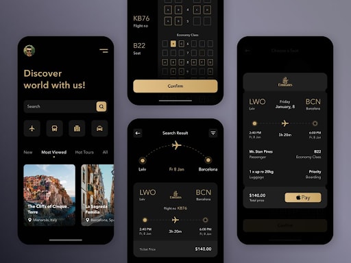
A dark mode was slowly taking over both mobile and web solutions. At first, only such giants as Instagram offered its users this background. It’s easy to get used to good things, so soon enough we desired to see a dark mode option in all kinds of applications.
In early 2021, a dark mode was only gaining its popularity — it gives our eyes such a needed relief, changes how we perceive UI elements, and overall offers a fresh look. No wonder that over the past year most apps did adopt dark mode.
Now, it’s not an innovation anymore. We all expect to see a dark mode option by default when downloading a new app.
Animation
Animation has been there for quite a while now. The microtrends were changing, from liquid motion to neumorphism, but the presence of animation in mobile app designs remains consistent.
Again, while some time ago seeing an animated element in an application might have raised the user’s eyebrows, now it is something we always expect and don’t pay too much attention to anymore.
Remember that the wider adoption of 5G gives designers even more freedom in the complexity of their ideas and here you go, animation is a prevailing element in many mobile products.
If you want to stand out with your animated solutions, it’s time to roll out something more peculiar than just letters moving around. We gave you some ideas for trendy animation approaches in the recent article.
Real-life pictures
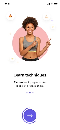
One more once a trend but now just a normal practice is using photos in your mobile app UIs. Adding real-life pictures might seem like a go-to technique for mobile apps; how can you have, let’s say, a clothing store without lots of photos?
Yes, that’s correct. But this conversation is about applications that do not necessarily ask for photos in their interfaces. For example, adding such images to the onboarding screens or fitness apps, like we once did.
Long story short, for us it is normal to see photos in all kinds of mobile applications, even in games. But just some months ago it was a way to stand out with your design.
Bottom line
We hope this little insight helped you understand or maybe reminded you once again why it’s important to stay on top of design trends. The lifespan of a design trend is not that big, so the period between its first appearance and becoming common practice is rather short — don’t miss out on that.
What do you think about design trends: do they come and go or have a bigger impact? Share your opinion in the comments!
If you are ready to explore 2022 mobile app UI/UX design trends, we invite you to have a look at our predictions.


Top comments (0)