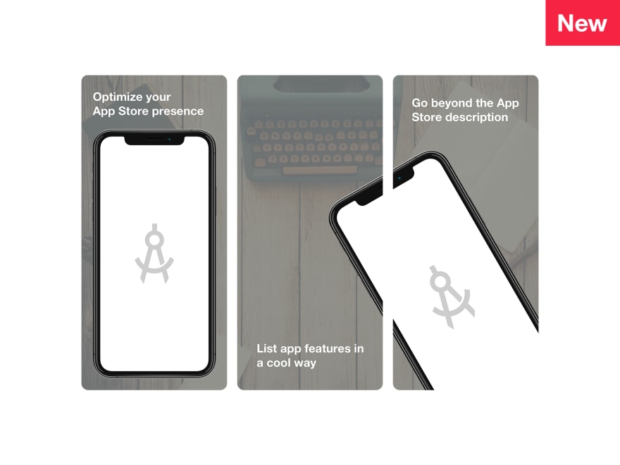
Selection of App Store screenshots mockups in PSD and Sketch designed to help iOS apps stand out on the market.
We invite you to scroll through the list below, and then, at the end of the article, you will find some tips on how to use these templates to make highly effective screenshots.
App Store Template by Ramotion
App Store Previews (Sketch Freebie) by Ryan Houk
Scannable Screenshots by Apple Pixels
App Store Templates for Sketch by Zack Gemmell
App Store Screenshots Template for Sketch by J.Holloran
We hope you will find these mockups useful for your app screens. Below you will find some helpful tips on how to customize these templates to make unique screens that will stand out on the AppStore and help you drive more downloads and purchases.
How to Create The Best Screenshots for Your App on App Store using iPhone Mockups
Whatever product you have, it should be exposed to the audience in a way that will boost its popularity and ipso facto increase CTR. In App Store, it means creating an outstanding promotional page.
The promotional page allows adding different kinds of information; however, as practice shows, people prefer to scan rather than read. Screenshots of the application are what catches an eye of the readers in the first place. Therefore, it is crucial to make them count. This task may seem challenging and exacting since all you have is several slots. Nevertheless, everything is possible when creativity is involved. There are several helpful tricks that will help to create amazing screenshots of your application, and highly realistic iPhone mockups stand in the heart of them.
First things first
Before jumping into creating the best screenshots for your app, you need to know the basics. Meeting Apple’s specifications is the first task to tackle. You should be familiar with what kind of graphics to provide the store with. Here is the short list:
- Flattened JPEG or PNG format;
- 72 dpi pixel density;
- RGB color scheme;
- No transparent backgrounds;
- The best quality;
What’s more, the screenshots should also fit different resolutions to look good and consistent across various gadgets. While in the past you had to create different variants of the same image, these days thanks to the simplified screenshot submission process you can skip this stage and let the Apple do all the heavy lifting.
Well, it is time to embark on our adventure of creating the best App Store screenshots using iPhone mockups. We are going to divide this process into three main stages. First, we need to create an artistic presentation, then enhance it with information, and finally take it to the next level by adding emotions. Let us begin.
Create an Artistic Presentation
There are many ways of pulling off artistic presentation; however, storytelling experience is one of the preferable ones. The reason is simple: people love stories whereas app makers love to tell them especially ones where their product is a protagonist. Why not use it to your advantage and benefit from such a favorable situation?
The key moments of creating the best novel ever are:
- Bet everything on the beginning of the story. People on large desktops will see just the first 4 images, while ones who use smaller devices will end up with only 3.
- Get in user’s shoes and choose the strongest selling points of an application from their point of view. Show them what they can do with your app.
- Stay consistent all the time. Do not shift between different color schemes and fonts.
- Be concise: create a synopsis rather than epopee.
- Stay creative with the design. Do not go for just plain screenshots of the application displayed one by one. Spice things up by playing with an angle or showing only a part of the program.
- Show the app running on a device like it is a part of the real world, which everyone can touch, feel, and experience.
- Reflect your brand identity.
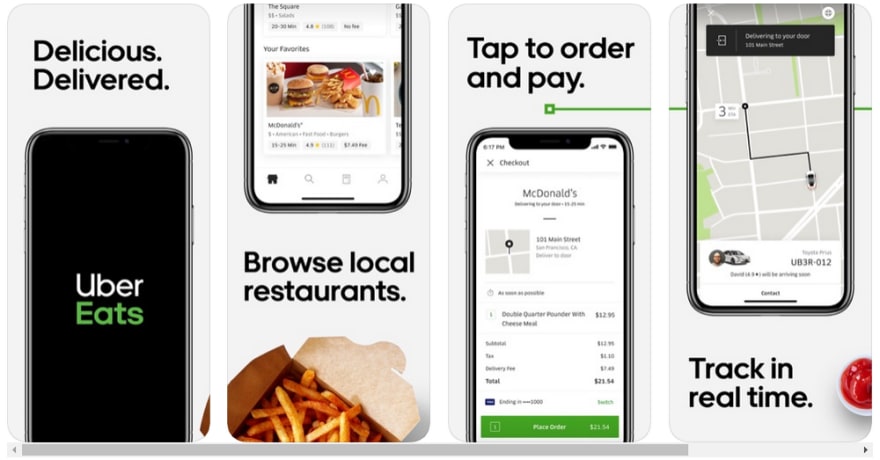
The excellent example of these points to be put into play is Uber Eats whose team was managed to successfully embrace the power of storytelling experience. Everything starts with the homepage that reveals the brand. After that, they walk users through the stages of ordering, making this process enjoyable and straightforward by supporting it with proper visuals and content. Simple yet brilliant.

To pull this at home, take one of the highly realistic device mockups that are available in the iPhone Sketch mockup bundle. Choose the frontal view and place inside images to reveal your story. Play with the composition and display. For instance split the image and place it inside two different slots to make the storytelling exciting.
Improve It with Content
Although the picture is worth a thousand word, however content is a king. People should enjoy your story rather than playing a guessing game or even worse arriving at wrong conclusions. Therefore, use captions, catchy phrases, and even short instructions. The best practice is to place them on the top since people start to scan from there.
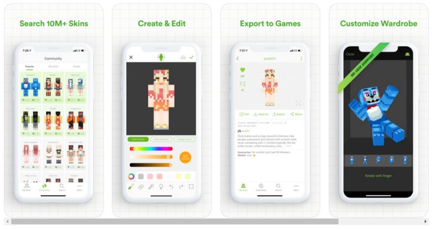
Skinseed is an excellent point in case. Their presentation is creative and informative at the same time. And it does not overwhelm viewers with too much data since the team has cut it to the bone.
To come up with something similar, use iPhone mockups that will seamlessly work screenshots into the composition providing them with a solid base. Choose the color for captions that stands in stark contrast to the background and typeface that is legible across various resolutions. Here you can also stress out the important words by underlying them or making bolder. Describe the screen in two-three words.
Complete it with Emotions
Psychological tricks never get old. They perfectly work in the market where raw advertising is not enough to foist the goods. Right emotions are what forces customers to make their decision. If people like your product, then chances are, they will buy it. There are many ways to trigger this feeling. For example, buyers may like your application because it feels trustworthy. So that it won’t be a waste of time. Use highly realistic iPhone mockups for this.
When smartly dished up, they may cause various sensations that may be beneficial for manipulating the decision-making process. For instance, they can
- elicit trust;
- enhance credibility;
- make an application feel on-brandy;
- give an application a veneer of sophistication to make it look exclusive and luxurious.
Use iPhone screen mockup for making this trick work for you. The selection includes all the beloved options these days. Therefore, you can use their popularity to benefit your presentation. Also, use an isometric view with the monitor turned to the audience to not just grab users' attention with intriguing perspective but also humanize your app a little bit. Not only will the application look organic, but it will also appeal to the audience triggering the right emotions.
Conclusion
Creating the best screenshots for your app on App Store using mockups is not a challenging task at all. All you need to do is to use your imagination to reveal a compelling story about your product.


Top comments (1)
Using mockup templates in PSD or Sketch can streamline the process of Honista Apk Download creating professional-looking App Store screenshots. They're a great tool for ensuring consistency and visual appeal in your app presentation.