To design a Landing Page with Figma, you don’t have to be an expert in Figma. In fact, you can create a Landing page design in no time at all using the Theme Composer Figma plugin.
In this quick tutorial, we’ll use the Theme Composer Figma plugin to show you how to create a landing page, customize it, and covert it to HTML/CSS code.
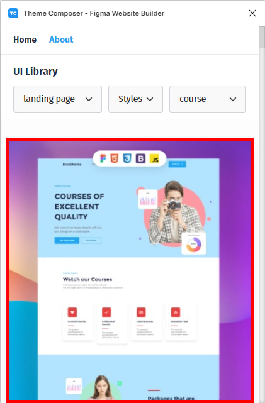
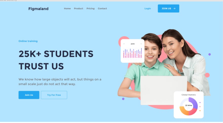
So, in this tutorial, we’ll create a course landing page and here’s a sneak peek at what the finished design will look like.
To be able to design this landing page, we’ll see how to :
- Generate a landing page design with the Theme Composer plugin.
- How to add our text and images content to the landing page.
- We’ll also see how to edit the color palette of the landing page.
- And lastly, we will convert our landing page to a responsive HTML code.
Let’s get started.
Video Tutorial Here!
Install Theme Composer Plugin
Before we begin, let’s install the Theme Composer plugin to our Figma editor.
To install the plugin:
- First, head to figma.com/community
- In the community search bar, you can type : theme composer
- Now, select the plugin tab below the navbar.
- And hit the Install button in the right corner of the plugin’s preview.
- You can also install the plugin using the following link : https://www.figma.com/community/plugin/1031231406409957685/Theme-Composer---Figma-Website-Builder
- Hit the Install button in the top-right corner of the plugin’s home page to install.
To see the plugin in action, let’s go to our Figma editor and create a new Figma file.
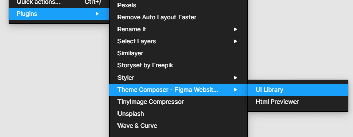
- Then, right MouseClick on your canvas and go to plugin > Theme Composer.
Theme Composer is split into two sections: a User Interface Library and an HTML Generator.
Let’s open the UI Library section first
- Go to plugin > Theme Composer > UI Library
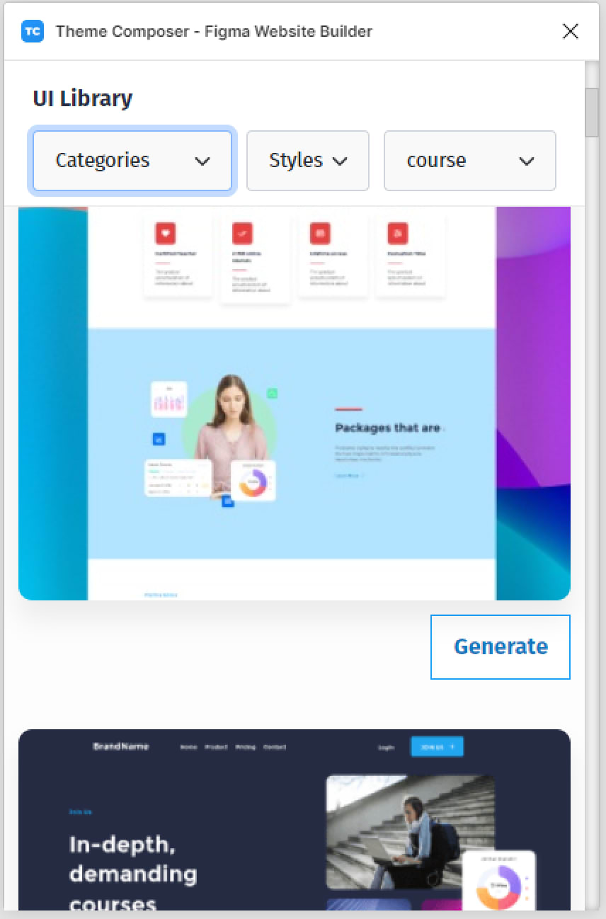
You can scroll down in the plugin to see a wide range of ready to use landing pages, headers, features, call to actions, footers and many other building blocks at your disposal that you can use to build your website without the need to any design skills.
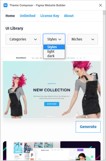
You can use the plugin’s drop-down menus to navigate through the available UI Library categories.
- Hit the Categories dropdown menu to see all the design categories available.
Every design element has two distinct styles: light and dark.
You can also filter by Niches , like course, medical, school, legal, services and so on.
- Hit the Styles drop-down menu to choose between Light or Dark style.
- If you want to filter UI Elements by niches, click on the Niches drop-down to get access to all the design niches available.
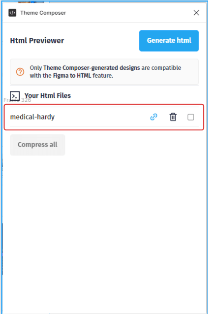
The second section of the plugin is the Html Previewer. This section allows you to convert every User Interface available in the Theme Composer UI Library to HTML easily.
- In the Html Previewer section, you can generate and access your design’s code source.
After this brief tour of the Plugin, let’s begin our tutorial.
1- Generate the landing page design
To start, we’re gonna generate our landing page design First.
Let’s open the Theme Composer plugin.
- Go to plugin > Theme Composer > UI Library
- In the Categories drop-down menu select landing page.
- Then select course in the Niches drop-down
We’re gonna pick the first landing page design in the UI Library.
To generate the landing page click on the Generate button bellow the landing page thumbnail.
It will take some times for the plugin to generate all the layers, images and styles of the landing page.
Now that we’ve generated our landing page, we need to add our text and images content and edit our color styles.
2 — Edit the Landing Page Content
1 — Replace The Default Text Content
Let’s jump to the top of our landing page.
I would like to start by changing our logo placeholder. It is super easy to do it.
- First, hold the CTRL or Command key in mac and click on the logo layer with the left MouseKey.
- Now, double click to select the logo’s content.
We’re going to replace the text Medical Hardy with Figmaland. That’s about it, you can now change any text layer following these simple steps.
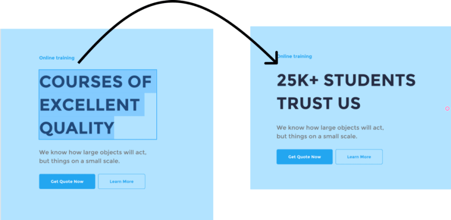
We’ll also change our headline.
- Hold the CTRL or Command key in mac and select the headline layer with the left MouseKey.
- Then, double click to select the headline’s content and replace the placeholder content our headline content.
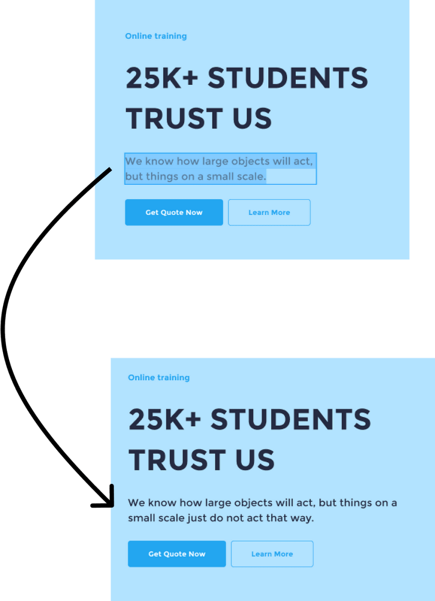
We’ll do the same for the sub-headline.
- Hold the CTRL or Command key in mac and select the sub-headline layer with the left MouseKey.
- Then, double click to select the sub-headline ’s content and replace the placeholder content with our content.
We can Also change the text on our buttons using the same steps as before.
Let’s move faster with the other text layers.
After being done with our text content, we’ll move to edit our landing page images.
2 — Replace The Default Images
Let’s change our Header’s hero image.
First, we’ll hold the CTRL or Command key in mac, and click on the image layer of our header with the left MouseKey to select it.
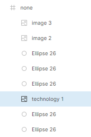
Now, we’ll go to the layer section in the left hand sidebar and make sur the layer technology 1 is selected.
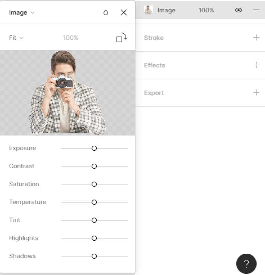
After selecting our image layer, let’s head to the Fill section in the right-hand sidebar. Hit the image layer inside the Fill section to trigger the image modal.
Now, we can hover on top of the image box in the modal to see the Choose Image button appears in the center of the image box.
Let’s click on Choose image , and pick our desired image from the folder window.
Again to move fast in this tutorial, I will speed-up a little the process of editing the images content.
After editing our design’s content, we’ll see how we can customize more our design by editing its color styles.
3 — Edit the Color Styles
The Figma color styles allow us to easily access and change the color palette of our landing page. Let’s say we want to change the color of our buttons.
- First, we’ll Select the layer of our “Join Us” button
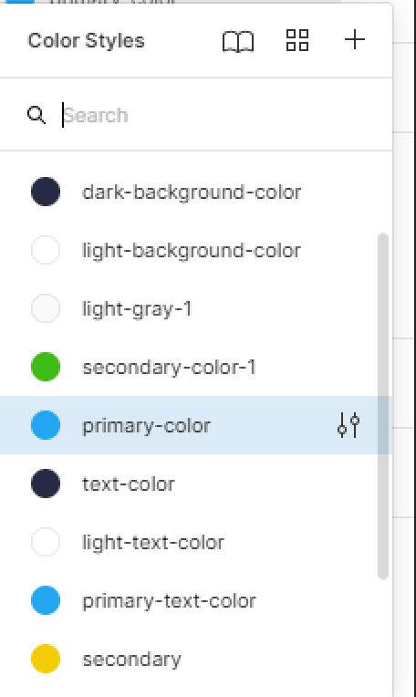
- Then, head to the Fill section in the right-hand sidebar. Select the layer’s color style which is “ primary-color” to trigger the color styles list.
A modal box will appear besides primary-color.
- Select the color square on the bottom section of the modal to trigger the color picker.
Now, let’s pick a bright orange color on the color picker or add this code to the Hex input field: F03C23.
Our new color will be applied to every component with the primary-color style attached to it.
To see a list of all the color styles used on our landing page, simply click on the gray backdrop area. A list of color styles will be displayed in the right-hand sidebar.
You can edit any landing page color style as you see fit.
Now that we’ve inserted our content, we’ll move on to the exciting portion of this tutorial: converting our Figma landing page design to HTML.
3 — Convert the Landing Page to HTML
Let me to show you how to transform our design to a W3C valid Html code, and off course it is fully responsive. All that is done inside Figma, without the need to open a code editor or write a single line of code.
- First, select the landing page frame and go to plugin > Theme Composer > Html Previewer
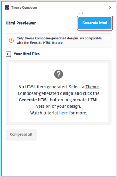
- Hold the Generate Html button to generate the code source of the landing page
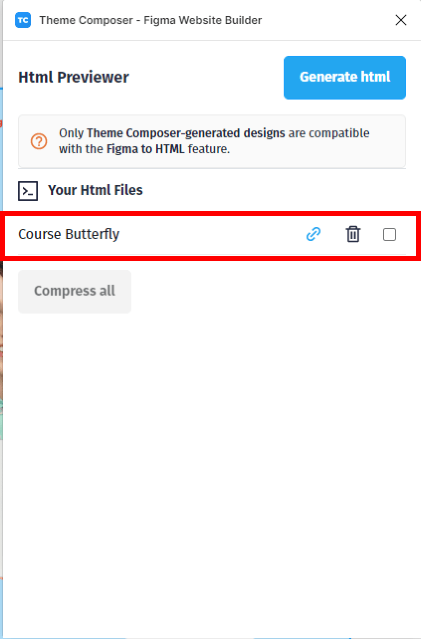
- In the Html Previewer section, we can access our landing page code source.
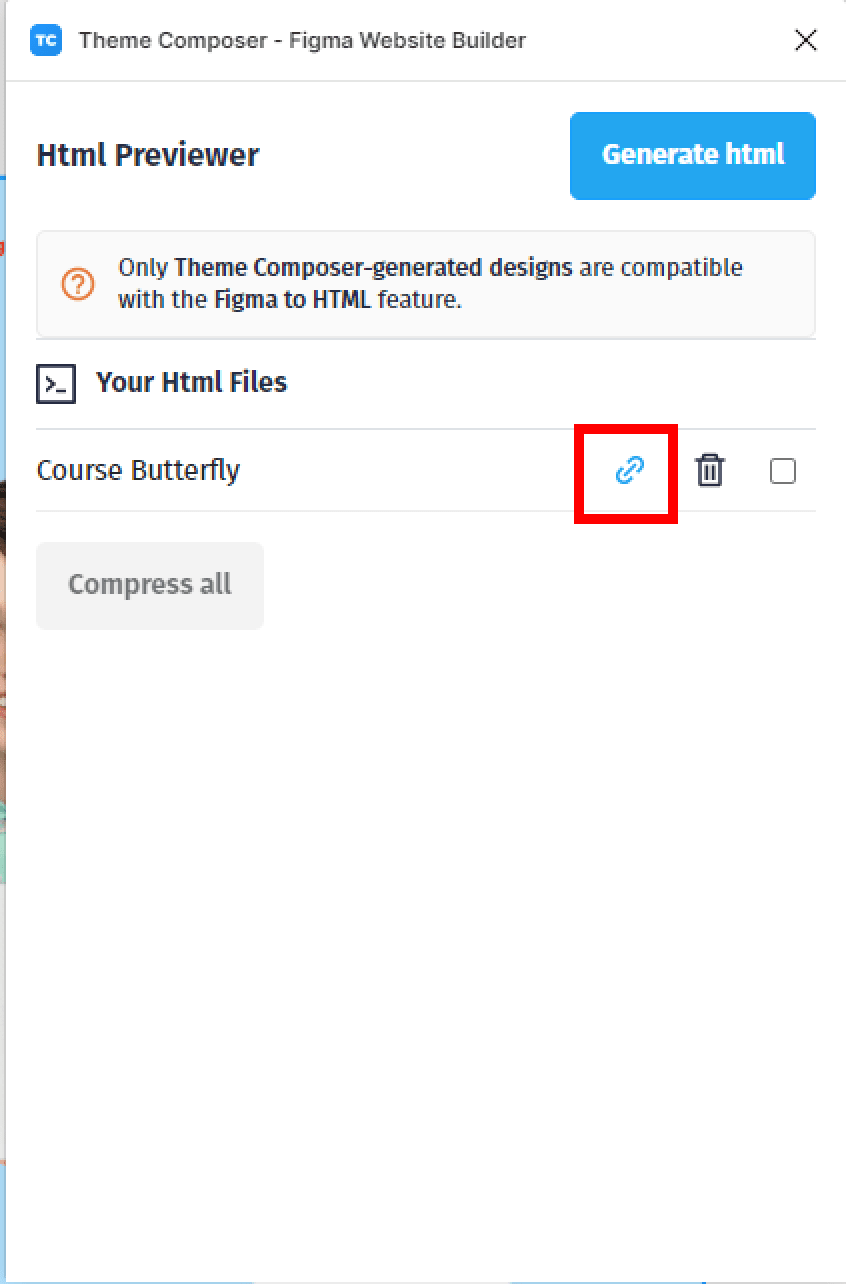
Besides the code source item in the Html previewer , we have the ability to generate a preview link , download a Zip file of our landing page code.
- To generate a preview link or download a Zip file, hit the Link icon.
- Select the Preview URL button to copy a preview URL of our landing page.
- Now let’s paste the URL generated to our favorite browser to see our landing page in action.
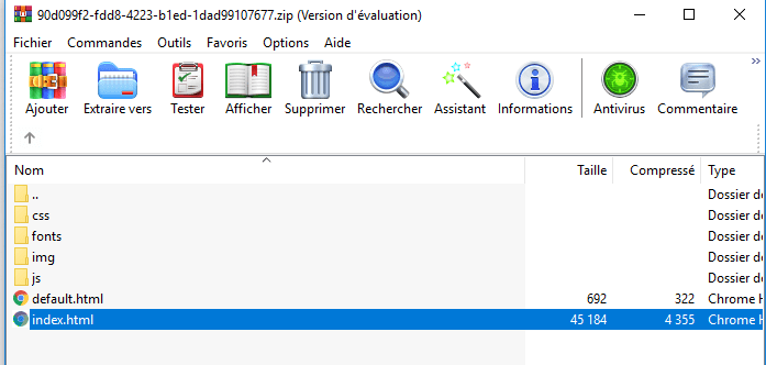
- To download the code source of the landing page, hit the *Download * button.
Theme Composer will create a ZIP file that contains all of the code for our landing page.
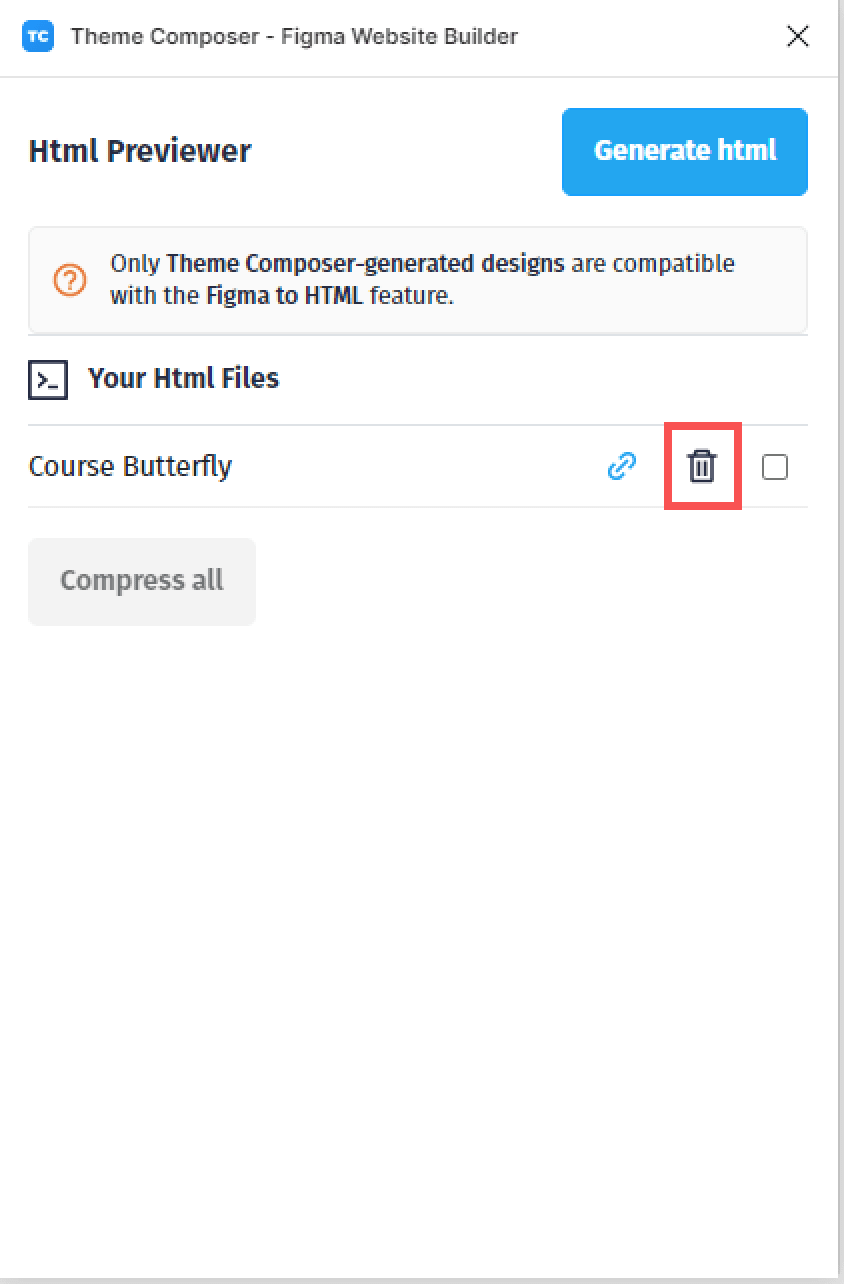
We can also delete the generated HTML item with the bin icon.
And that brings us to the end of our medical landing page Figma tutorial. I hope you find this tutorial useful for your future project.
In this tutorial, we learnt how to use the Figma Theme Composer Plugin to create a medical landing page, edit it, and export its HTML code.
Before you go
Fell free to visit our website Figmaland.com where we are sharing generously, ready for commercial use Figma and HTML templates.
You’ll find three things to help you kickstart your next project’s design :

























Top comments (1)
Thank you kindly for that!