Bootstrap is great for building your web. It's simple, fast, and has great mobile support. But, making your site too "bootstrapped" is not a good thing, especially if you are a pixel game studio.
Let's take a look at this. This is our website's old display.
Looks nice and clean. But, it has one big problem, too usual. It's a big horrible mistake for us who works in the creative industry (well, this is hyperbole).
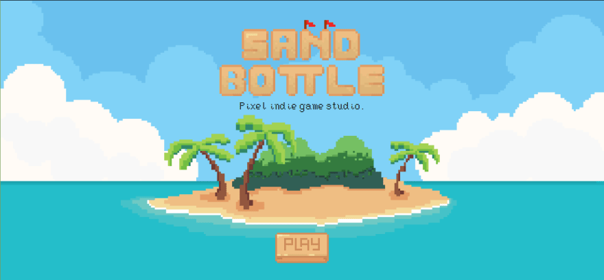
And, here's our new website's display.

Not perfect, but we're proud of this shiny-polished new website.
Our quest start.
As a game developer, assets size doesn't matter. Because assets can bloat it to the app, clients won't feel the long-loading time for the assets. This is a bit different with the web. We need to keep the file size as low as possible, use as low as possible resources, and keep the load time fast.
Designing.
Start with a concept. We use something that relates with our studio's name, Sandbottle;
Beach.
We also design the web like a retro-style game, with that big game title at the top-center, and a play button that can't play anything (lol) at the bottom-center of the page.
Start drawing
Drawing isn't a big thing when you are a pixel game studio. Right?
The answer is no.
Why? Since we only have one artist, and they are currently unavailable now. We also can't pay another, because we have some lack of cash. So, I need to wear my beret and paint that on my own.
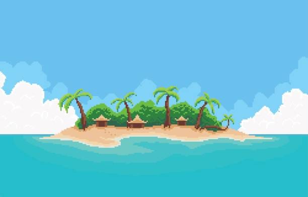
Start searching for reference, I found this great image for reference:
That image was perfect like we need it. It has some padding at the sides and centered content exactly was planned before:
So, I'm starting to redraw that image partially. Remove and add some parts, and hocus pocus, I don't know how I can finish it.
Don't forget about the button, still to draw it.
For the button, I'm using a 32x32 px canvas, and drawing it as a 5 frames animated sprite, like this:
After doing that all, I'm drawing one more thing; the game title. Drawing the game title is the easiest part of my part-time artist journey, because I just simply copy the font and modify a bit of it from here.
Start coding
In this part, I'm doing some CSSs that centered the images, put the game title at the top and the button down.
I also want that button can play its animation when hovered. Since (pure) JavaScript can't control gif playback, I'm coding this little function;
function hover() {
    $('#gif').show()
    $('#png').hide()
}

function leave() {
    $('#gif').hide()
    $('#png').show()

    $('#gif').attr('src', '/images/button.gif?x=' + Math.random())
}
The function will show the static png when the button is unhovered, and the function will change it to gif when it's hovered.
Final test
Let's test our web with the lighthouse. Here's the result. Pretty insane right?
I think that enough for today. Kinda fun to be an artist sometimes.
Hit also the web here: https://sandbottle.net
[ Note ]
This article is reuploaded because it's accidentally removed.


Top comments (0)