The display: flex property is a powerful tool in modern CSS that allows developers to create flexible, responsive and user-friendly layouts. It is a layout mode that makes it easier to align elements within a container and distribute space among them. It's a value of the display property in CSS, which is used to specify the type of box to generate for an HTML element.
Flexbox is designed to provide a consistent layout on different screen sizes, and allows items within a container to be laid out in any direction. Flexbox is best suited for small-scale layouts and can make it easier to build responsive designs that adapt to different screen sizes and device types.
Here's how you can use the display: flex property in your CSS:
.container {

  display: flex;

}
This sets the display value of the .container class to flex, which means that the elements within the container will be arranged according to the rules of the flexbox layout.
There are several other properties that can be used in combination with display: flex to control the layout and behavior of elements within a container. Some of the most important ones include:
flex-direction:
This property determines the main axis of the flex container and allows you to specify whether elements should be laid out horizontally (row) or vertically (column).
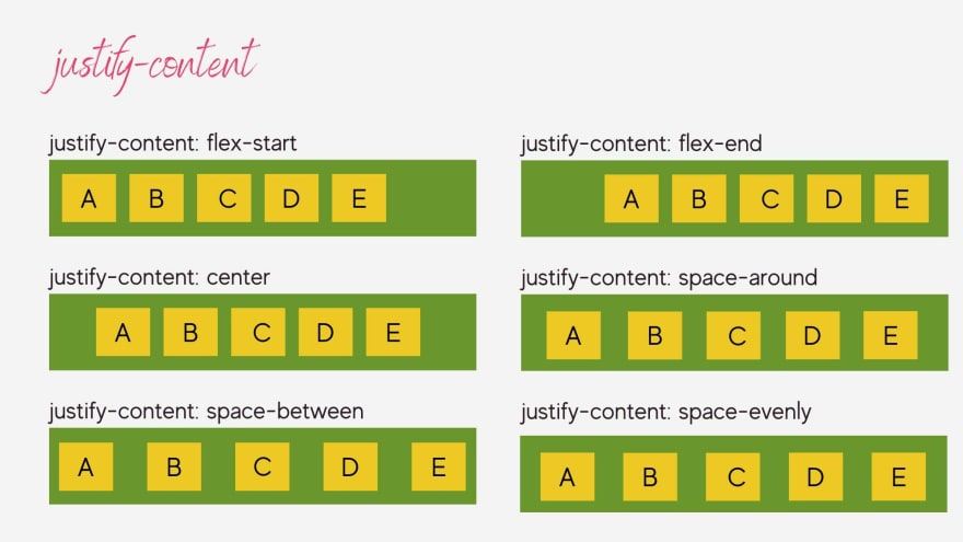
justify-content:
This property determines the alignment of items along the main axis of the container. You can use this property to align elements to the start, end, center, or between space of the container.
align-items
This property determines the alignment of items along the cross axis of the container. You can use this property to align elements to the start, end, center, or stretch of the container.
flex-wrap
This property determines whether elements within a container should wrap onto multiple lines, and provides options for controlling how elements are wrapped.
flex-grow
This property determines the proportion of available space that an item should take up. You can use this property to specify how much an element should grow relative to other elements in the container.
By using these properties together, you can create a wide range of flexible, responsive and user-friendly layouts. Whether you're building a simple one-page website or a complex application, display: flex can make it easier to create the layout you need.
Support
Thanks for reading!
If you have any questions, complaints or tips, you can leave them here in the comments. I will be happy to answer!
😊😊 See you later! 😊😊


Top comments (1)
A great article on flexbox in details. Thanks for sharing this..