I've recently open-sourced a new 📈 Coronavirus (COVID-19) Dashboard which shows the dynamics (the curvature of the graph) of Сoronavirus distribution per country.
Reasoning
The reason for creating a new dashboard was to complement the well-known JHU Dashboard (which is made by Johns Hopkins CSSE) with the feature of seeing the charts with the number of COVID-19 confirmed / recovered/ deaths use-cases per country.
Basically, I personally had a question like "What about the Netherlands/Ukraine?", "Is the virus spread (growth factor) slowing down?", "How I can compare the recovered/deaths dynamics per-country?", "Which countries are doing the proper things to slow down the growth-factor".
Here is how the main function looks like:
Data source and tech-stack
The dashboard is using COVID-19 (2019-nCoV) Data Repository by Johns Hopkins CSSE as a data source.
Front-end wise I've tried to make it as simple as possible, therefore the dashboard is using a pure React.js (without JSX transpiler or CreateReactApp starter). To display the data I've used Charts.js to draw the chart and Bootstrap Table to display a sortable, searchable, and clickable data table.
Main Functionality
The dashboard is still raw but it provides the basic functionality of displaying the global and per-country data charts.
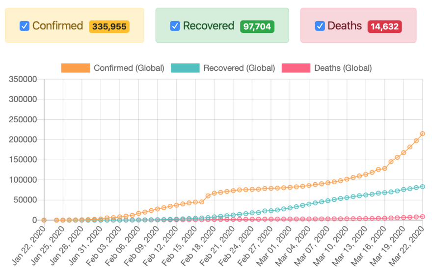
For example here is how Global dynamics of confirmed/recovered/deaths use-cases looks like as for March 23rd:
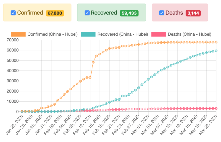
Here we may see positive dynamics for China (Hubei):
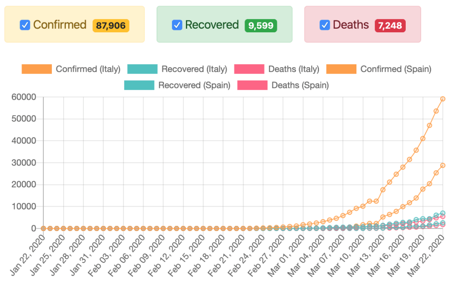
We may also compare Italy to Spain:
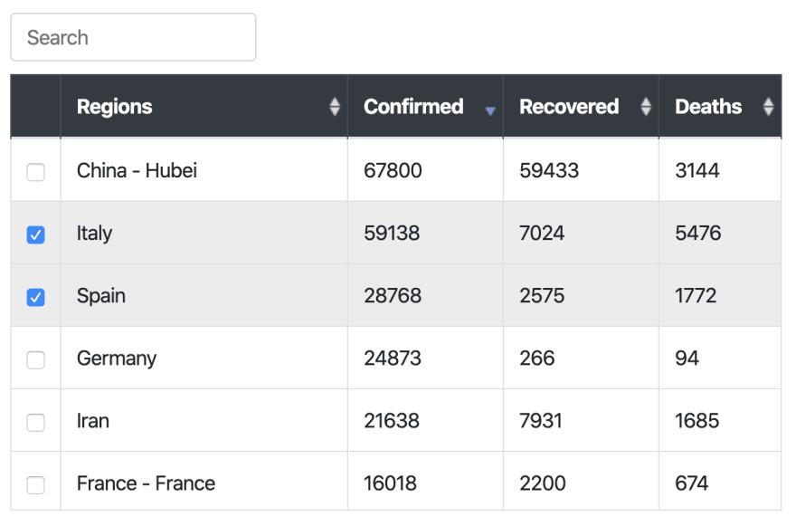
The regions are displayed in sortable, searchable, and clickable data-table:
Known issues
The following functionality is not implemented yet but it would improve the usability of the dashboard:
- Grouping the regions by countries to see aggregated statistics for the whole US, China, etc. (for now statistics for the US is split by states)
- Resetting the regions/countries selection by one click
- Putting the selected filters to the URL so that the dashboard link would be sharable (with pre-selected filters)


Top comments (116)
I've got one too, It's a little on the minimal side of things though
Covid-19 Counter
Great work! Would love to share mine too, coronavirus-epidemic.com
(Should be pandemic though! ) You can also read about it here coronavirus-covid-19-dashboard-wit...
great work.
I have some questions
Thanks
Hey @chan_austria777 ! Thank you for the feedback :) I created a post of my own with all the details - feel free to check it - coronavirus-covid-19-dashboard-wit...
thanks
This is so beautiful! Nice work!
Looks really pretty.
With Brave Browser the site didn't come up.
It works with Chrome instead.
I will definitely try on BB which i'm less familiar with.
Thank you for your comment!
I just tested it on BB, looks like its blocking for some security tracking reason (analytics/api) or because the name of the domain includes the word virus.. You can also check this link instead.
Thanks for your reply and the alternate link.
Nice one!
This is cool. What tools did you use to create this?
For backend I used TypeScript + Node.js, and for the frontend I used HTML, CSS, jQuery and lots of jQuery Plugins & Widgets
nice job! can you add a filter by continent? it's interesting expose the worst country of the continent by fatalities rate.
Thank you & this is a great idea :) !
You can get a more detailed view of corona here if you like: bing.com/covid
Can you tell if there's a free API to use with that?
Sorry, I dont know...
Theres a json with all the informations inside - bing.com/covid/data
So you should be able to consume that data.
I don't know which restrictions exists.
Though this app (bing.com/covid) is UX/UI-friendly, data are outdated. Take caution when using it. At the moment I am writing this, The global situation is 1,503,900 confirmed from here but from their site.
Another test, the situation in the DRC is 207 from this other source but 180 from our beautiful bing.com.
Looks great! Just one tiny bug I found.. Pagination doesn't reset when searching.
e.g: Type "Tu" and it shows 4 results and "17" pages.
Thanks for reporting the bug! Do you mean that countries table height is not being changed when, let's say, it is only two countries found as a search result?
That was for me, hahah
Sorry Oleksii! I meant to reply to only Sid's comment (I was referring to his app, not yours).
Your app works great btw, and I've already shared it :)
Haha! I see now :D
Oh thanks, Will be fixed today
Minimalistic but very nice, thanks for sharing.
Thanks
Well done!
Good job!
Well done!
Hi Siddharth, can you tell me how to get the data source?
the data source is a server that's scraping worldometers
Which API did you use?
Thanks in advance
It's a personal scraper that's reading data off of worldometer.info
Logarithmic scale for COVID-19 registered/recovered/deaths charts is now supported in the dashboard. Log scale makes it easier to compare the trends for countries with huge difference in absolute numbers.
📈 trekhleb.github.io/covid-19/
Nice work Oleksi, however, you are actually log-transforming the values, and not using the log scale. In log scale, the values are spaced according to the logarithm, however they are still the original values. Read on the different approaches here: people.umass.edu/whopper/posts/log...
Your solution loses interpretability.
Thanks for reporting that! I've created an issue here github.com/trekhleb/covid-19/issue...
The charts are nice, but with spreading like with the corona virus, it would be helpful if the scale was logarithmic, since the spreading of the virus is logarithmic. It would be cool if you could toggle between logarithmic and linear
Very good idea, Patrick. I've created an issue for that github.com/trekhleb/covid-19/issue...
this is great, the subtle chart js animation on load make this look really slick without overshadowing the story the data is telling. and thanks for open sourcing this - i got this running v quickly on glitch at trekhleb-covid-19.glitch.me/ and i'm going to get it added to this collection of covid-19 related apps other folks have been making on glitch.
one more github.com/MapaCoronavirus/mapacor...
Thanks for sharing it, Jenn!
When comparing two countries, it would be nice if one of them could move to a secondary axis. That way we can compare the shape of the two, instead of the absolute numbers.
And additionally, adding a (negative) offset to one of the two would be awesome as well, so we can overlay them.
Thanks Stephan, that functionality might be useful!
Should try SIR model for each country in order to see where we are in the SIR model graph and what to expect in the future, I mean the time where the infected people rate will start to decrease.
Just an idea.
Congrats and regards : D
Yeah, it would be really nice to implement some sort of a prognosis for that data.
Hello Oleksii, well done on building this. I haven't looked at the source.
My summary on this is we need more granular data on different pandemics and epidemics to let data experts on this site provide the results to people like you. Unfortunately the data this is based off of is from the WHO website - which is lacking granularity.
My major concern with Coronavirus is around the narrative being portrayed, the number of eminent epidemiologists who are stating things like; social distancing doesn't work, that the deaths are truly weighted towards vulnerable people, that the media puts out instances of outliers as major scare stories - i.e. a young woman who is healthy may succumb to Covid-19. Another suspicion I have is that the testing is different in different countries - I worked in a testing laboratory many years ago and there are different tests for the same virus. We may find certain tests being nothing more than generic tests for standard coronavirus or antibody presence. Notice how many famous people are testing positive but having mild symptoms and recovering almost immediately. More concerningly - Tom Hanks - as a diabetic he is in a higher risk and age group.
So, what we have is a lack of granular data. Am certain many data people on this website would agree, and I am seriously concerned from a libertarian perspective we are simply throwing away our liberty off of what is still a very low infection rate. There are always mis-classifications of morbidity in terms of dying "with" or "of" something.
Does it mean we shouldn't self-isolate or minimise contact? The first thing anybody will do is go on Google or Bing to find studies say. We know that Social Media giants are advised and proactive in trying to dispel bad science. If we look hard enough - we find a lot of studies into previous epidemics that counters what the official narrative is. The histograms does show significant numbers of experts questioning our approach.
So, what would be great is if we can get more insightful data on this. I plan to try and find some.
Many thanks.
Exactly. If you have any luck please let me know and I will do the same.
It's a really cool idea Oleksii, well done!
There's one thing I always think about seeing these numbers which is the percentage of cases according to the population of the countries. Because let's say 80.000 cases in China is very different from 80.000 cases in Italy, whose population is much, much less. So in my opinion, it would be a nice addition to see the percentages in the Bootstrap Table in a new column. Anyhow, good job and keep it up!
Very good idea Thomas! I've created another issue for that in Dashboard repo: github.com/trekhleb/covid-19/issue...
Created a similar one using ant UI and bizcharts:
kokanek.github.io/corona-tracker/
Nice one!
what does "percentage increase" mean?
A measure of the increase in the number of cases in the last day compared to total cases.
Great work Oleksii !!
Any chance you can allow the Y-axis to be viewed per /100 000 inhabitants or (per 1million) for each country? I think it would be far more relevant than a comparison of the absolute number of cases.
Good suggestion! There is an issue reported for that already github.com/trekhleb/covid-19/issue...