
What is react-popupify?
React-Popupify is a simple and easy to use popup component library for Reactjs applications. It manages popups using a singleton pattern with a central popup manager instead relies on a global manager to handle popups.
JavaScript's default alert, confirm, and prompt dialogues have long served as a standard for simplicity. However, they suffer from several UI inconsistencies, especially when integrated into modern web applications with custom styling and user interfaces. These inconsistencies can lead to a jarring user experience, disrupting the overall aesthetic and feel of the application.
To address these issues, react-popupify come into place, a React library designed to provide consistent and customizable popup dialogs. With feature like controlled visibility and customizable behavior to support for transitions and focus management, the library addresses many common needs when working with popups and modals, ensuring a smooth and accessible user experience.
Key Features
- Easy to Use: Simple API for quick integration.
- Highly Customizable: Customizable transitions, styles, and behavior.
-
Custom Animations: Supports various animation types such as
bounce,flip,zoom, andfade. - Auto-Close: Option to auto-close the popup after a specified duration.
- Event Handlers: Callbacks for when the popup is entered and exited.
- Esc Key and Outside Click: Configurable options to close the popup using the escape key or clicking outside.
- Component-Based: Built with modern React principles and practices.
Installation
You can install react-popupify via npm:
npm install react-popupify
How It Works
Using react-popupify is straightforward. Here's a quick guide to get you started:
1 Adding CSS
import "react-popupify/dist/bundle.css";
2 Create Popup Components
  import React from 'react';
  import { Popup } from 'react-popupify';

  const CustomPopup = () => {

    return (
          <Popup
            popupId="customPopupId"
            animation="bounce"
            open={false}
            closeOnEscape={true}
            closeOnOutsideClick={true}
            closeButton={true}
        >
          Say Hello to React-Poupify !!
        </Popup>
    );
  }

export default CustomPopup
3 Import CustomPopup into to root of your project:
  import React from 'react';

  const App = () => {

    return (
    // importing custom popup to root of project
    <CustomProject />
    );
  }

  export default App
4 Display Popups
Use the showPopup instance to show popups:
import React from 'react';
import { showPopup } from 'react-popupify'
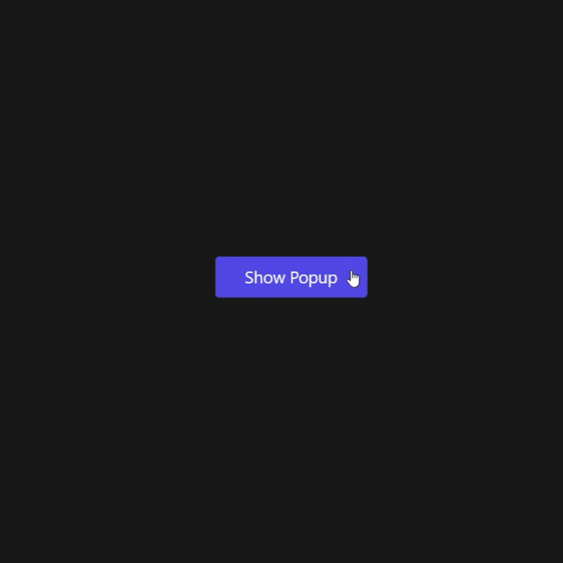
const PopupButton= () => {
const popup = () => showPopup('customPopupId', { open: true })
return (
<div>
<button onClick={popup}>Show Popup!</button>
</div>
);
}
export default PopupButton
Contributing
I welcome contributions to react-popupify. If you have ideas for new features, improvements, or bug fixes, feel free to open an issue or submit a pull request on GitHub.
Check out the GitHub repository for more details, and don't forget to ⭐ star the project if you like it!
Happy coding! 🚀


Top comments (0)