There's a video version of this blog! Watch it here!
Don’t Be Overwhelming
Your MAIN job as a UI Designer, is to make everything clear as day!
Your users should have a very easy time browsing your UI. Everything should come naturally. Even if the user has never used the UI, he/she should know what's going on immediately.
Take a look at these examples:
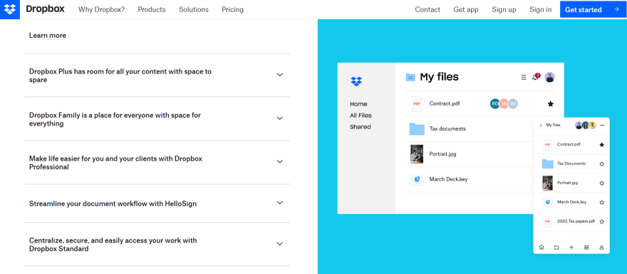
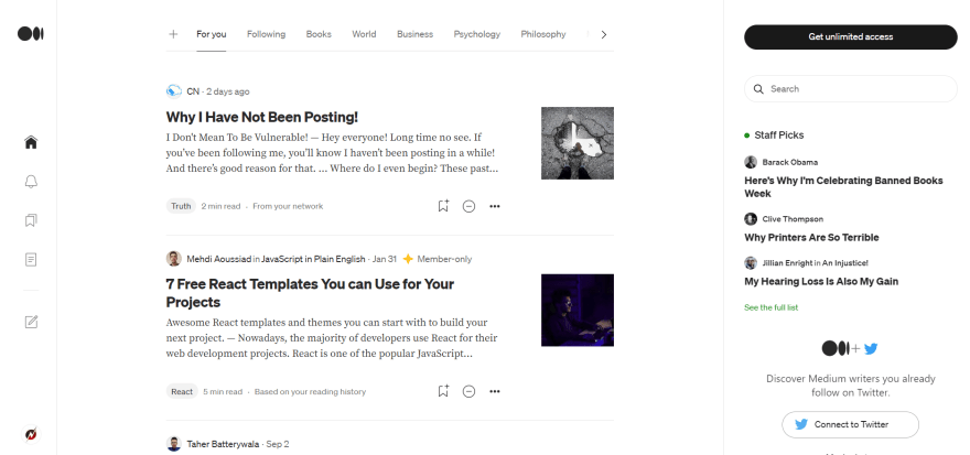
 This website is very overwhelming, you don’t even know what’s going on.
 This website though, you understand everything!
2-3 Colors!
This is more of an extension of the first rule, but it’s important it’s specified.
It’s easy to overdo it with colors. That’s why it’s important to choose your color palette before you even start.
Except for white and black, you should be using ONLY, 2-3 colors. If you need to use more than 2-3, think of E-Commerce websites, you can use shades of those colors.
This is because using, 2-3 colors gives a sense of familiarity and makes everything clear.
For example, your users can learn to distinguish the color, purple for the color that’s used in headers.
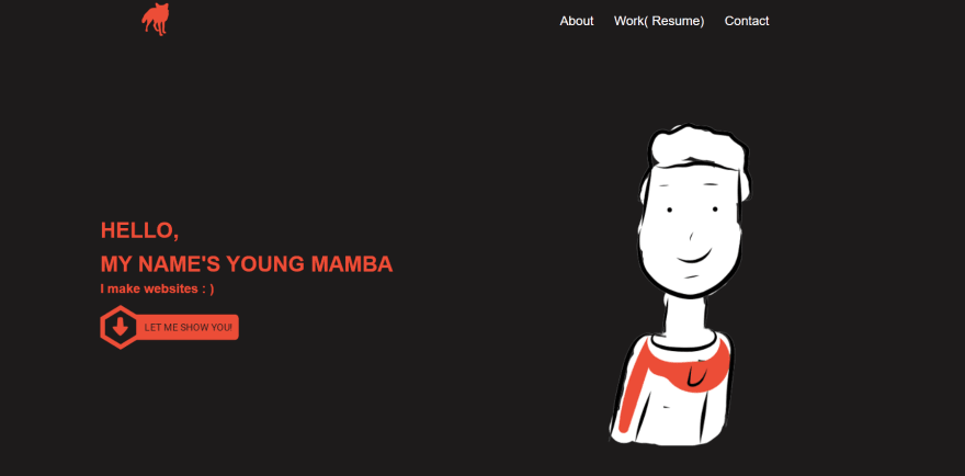
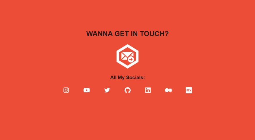
It’s hard to explain, in words so here are some examples:
Don't Do:
Do:
Images however are an exception to the rule. Sometimes
Consistency
Make sure that everything is consistent.
Make sure your typography FONT is the same everywhere( note: there’s some cases where you can use different fonts for your logo).
Make sure your spacing is the same everywhere. You don’t want to have margins of 5px here and 10px there. Everything should be the same.
Make sure your headers are the same size, and normal text size is the same.
I can go on and on but you get the point!
DEV is a great example of Consistent UI!
See also:
Visual Hierarchy
There should be a clear distinction between primary and secondary.
Try to emphasize the primary objective. Everything can't be the same!
Couldn't find examples for this one!
Icons and Images
Ever heard of, A Picture Is Worth A Thousand Words?!
Well, it's very true.
Remember people don't read( unless they're on a blog website lol, but even then I dough that) they scan.
Images can be a great way to get a message across fast.
They can also bring life to your website. A lot of times having just text in plain and boring. Spice things up!


Top comments (0)