In this post, you will learn about the fundamentals of accessibility to ensure your website is usable by everyone.
This is the seventh post and video in a series on learning web development.
You may watch the following video or follow along with the expanded transcript that follows.
In this lesson, we will not create new code. Instead, I will demonstrate what accessibility is and the basic considerations for ensuring you create accessible web experiences.
View the live link of the demo >
First, let's start with a definition of accessibility from the Web Accessibility Initiative (WAI):
Web accessibility means that websites, tools, and technologies are designed and developed so that people with disabilities can use them. More specifically people can: perceive, understand, navigate, and interact with the Web; and contribute to the Web.
The WAI goes on to point out that it isn't just folks with clearly recognized disabilities, but also temporary or less perceivable impairments, such as:
- people using devices with small screens
- changing abilities due to aging
- temporary disablements such as a broken arm
- situational limitations such as screen glare from bright lights or the sun
It is possible to account for these scenarios, but it takes a conscious effort. Fortunately, there are in-depth guidelines and a wealth of resources to learn how to do it and to test outcomes.
Fundamentally, accessibility on the web starts with using HTML semantically. So congrats! You've already learned the bare essentials to making accessible web experiences from our first few lessons!
Today, we'll look at a few additional points to keep in mind as you move forward on your coding journey. Learning how to make accessible web experiences an inherent part of how you develop code is not only the right thing to do, it will give you a leg up in the job market as surprisingly, this is an area that a lot of online experiences, unfortunately, tend to neglect.
The topics we'll cover include:
Note that this lesson is not exhaustive of all accessibility concerns but is intended to place basic concepts in your development toolbox.
Hierarchy
We've actually already covered hierarchy throughout the HTML lessons. To re-cap, hierarchy begins with defining the structure of your text content with appropriate headings.
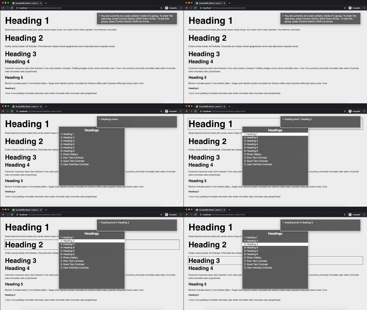
The following gif demonstrates how proper heading hierarchy can help a vision impaired user who needs to use assistive technology, often in the form of a screen reader. Being on a Mac, I have a built-in screen reader called Voice Over, or VO for short. I'm going to open that, and you'll see this window has appeared that provides written text in addition to the spoken feedback.
Within my example web page, I triggered a keyboard command to display the Headings. Then, using my arrow keys, I scrolled through the list, and then used the return key to select one. See how a black box was added to the "Heading 3" as an additional visual indication of where Voice Over was focused on the page.
Using an additional keyboard command, I can request Voice Over to read the document to me. Again, VO places a black box as a visual indicator as it moves throughout the document.
Content
VO was able to read that content very easily because it is using defined type elements. But there are other ways to define textual content, and a requirement for accessibility is that all content is perceivable. This means any non-text content should provide a text alternative, and there are several ways this can be done.
A common scenario that we've also already discussed is providing descriptions of images by way of the alt attribute. So let's move to the next section in this document, and see how VO is able to read the images thanks to the alt text.
Contrast
The next key concept is contrast. Contrast generally refers to color contrast of text or interface components, but for text it can also mean legibility.
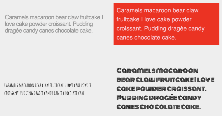
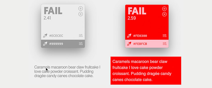
This first section shows examples of poor text contrast. The first two primarily demonstrate poor color contrast. Text must meeting a 4.5:1 contrast ratio against it's background to pass for accessibility.
This first example fails with a 2.41:1 ratio, and it also does poorly on general legibility due to tight line and letter spacing.
While it's not inherently wrong to use colorful text, it can be more difficult to ensure the paring meets contrast. The second example fails with a 2.59:1 ratio.
The third example is poor legibility from using a thin font at a small size, and the fourth also fails for legibility by using a decorative font for a long text block at a small size.
Let's look at some acceptable examples of text contrast.
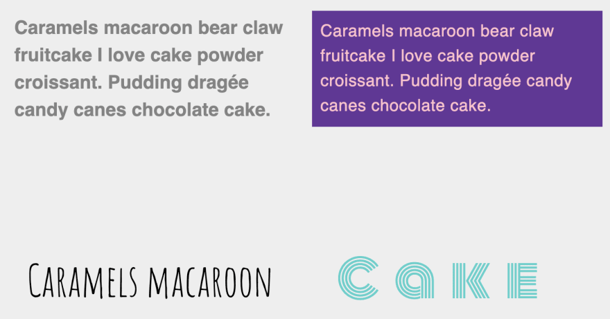
The first one demonstrates the exception to the text contrast rule: text which is at least 14px and bold or larger than 18px has a reduced contrast ratio of 3:1. This example is both 18px and bold and has a ratio of 3.25:1.
The next example passes contrast with flying - and bright - colors! The ratio here is 5.17:1!
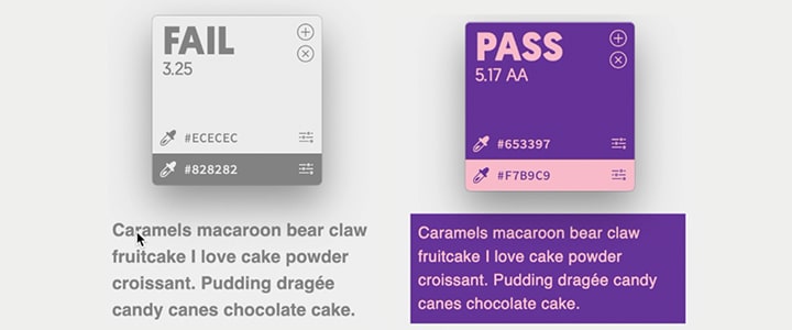
Note that the "Fail" is false as the contrast tool in use is unaware of the text size being tested
Next, there's an appropriate use of a thin font by increasing the size and limiting the length of the phrase. This might be acceptable for short headlines.
Finally, we've reduced the decorative font all the way down to one word to demonstrate another exception. If we imagine this is intended as the logo, then it is acceptable because logos are specifically exempt from contrast guidelines which makes the color choice ok too.
The other category for contrast is interactive user interface components such as form fields and buttons, as demonstrated here. UI components need to meet the 3:1 contrast for controls themselves, although text portions such as form labels should continue to meet 4.5:1 if not bold or smaller than 18px.
This first form field is missing the mark on contrast for both the label and the input border. The example next to it achieves appropriate contrast for both the label and input border.
The buttons comparisons are set up much the same, however, buttons typically have the expectation of a hover state, which is when the user mouses over it.
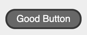
For the hover state of the "Good Button" you'll see that a dark background color has been applied and the text color swapped to white to retain contrast. Another important note is that we now must balance two levels of contrast: the button text against the button background at a 4.5:1, and the button background against the page background needs to remain at least 3:1.
Keyboard Interaction
Now, the final key topic is keyboard interaction. There is a category of users, whether or not they use VO, who are unable to use a mouse so they rely on either spoken or manual keyboard commands. A primary way these users navigate a website is tabbing from one interactive component to the next. For sighted users, it is important that interactive components provide visual feedback when they receive focus.
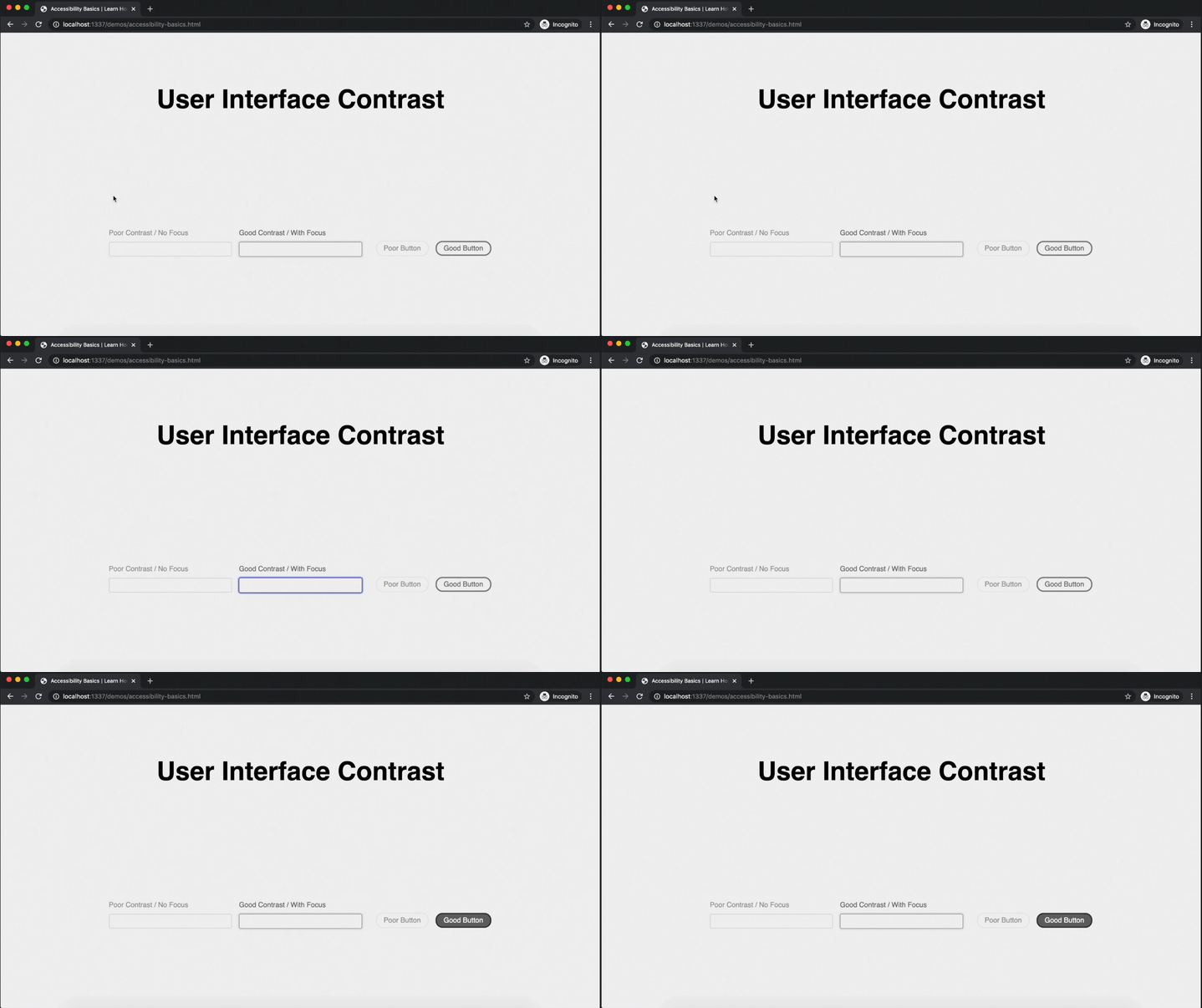
Looking at our text inputs and buttons, the gif demonstrates focus from keyboard tabbing. As I tab into the poor input field, the only indicator is the blinking text cursor. If I tab again into the good input, there is a clear visual border change. This focus is also under the same 3:1 color contrast requirement which should be measured against it's surrounding background.
When I tab to the poor button, you'll see no change. One more tab to the good button and you'll see we're using the same style offered on hover for this particular button.
Resources
There are many more areas of accessibility to be aware of, and we will explore other areas as we continue through this series. If you would like to start learning more, here are a few resource links:
- WAI Introduction to Web Accessibility: https://www.w3.org/WAI/fundamentals/accessibility-intro/
- WAI Easy Checks for Accessibility: https://www.w3.org/WAI/test-evaluate/preliminary/
- WAI Intro to Accessibility Principles: https://www.w3.org/WAI/fundamentals/accessibility-principles/
- A condensed guide to WCAG (Web Content Accessibility Guidelines): https://24ways.org/2017/wcag-for-people-who-havent-read-them/
- A11Y Style Guide accessible component reference: https://a11y-style-guide.com/style-guide/
- WebAIM Contrast Checker: https://webaim.org/resources/contrastchecker/
- Contraste desktop app (Mac only, used in demo): https://contrasteapp.com/
Next up in Episode 8: Intro to CSS





Top comments (0)