Hello everyone👋 This is Gaurav Gupta.
In this post, I'll be sharing a few low-fidelity screen designs of the application as well as some of the ideas regarding the design (If you don't know about the product, you can read this). Since the rough sketches shared in the previous post were made in a random screen resolution, we decided to test them on 1920 x 1080 frames on Figma.
❗ Note: All the colors used in the below designs are used to signify buttons or active fields and are not related to the color scheme of the application.
Dashboard
We recreated the rough sketch we shared in the previous post onto the frame resulting in the above-shown look. (I feel that there could be some changes to the dashboard, do let us know what improvements can be made). A comparison between the sketch we shared before and the recreation of it on 1920 x 1080 resolution frame:
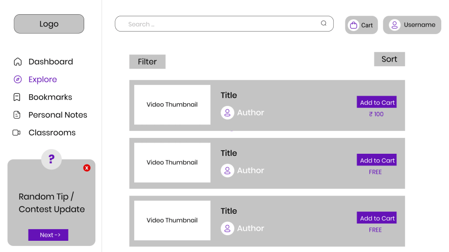
Explore
A quick comparison:
Bookmarks
The 'Recent' section would allow the horizontal scroll to go through the recently opened notes. The 'Continue' button would allow the users to jump to the sub-section where they left off.
Comparison:
Personal Notes
We plan to make the size of each notes card differ depending on the amount of content present inside the card (such as that in Google Keeps or Pinterest).
Comparison:
Classrooms
Comparison of Classrooms dashboard:
Classrooms Information
We require your suggestions regarding the interface for the Classroom Information page. We are confused between 2 different looks for the page.
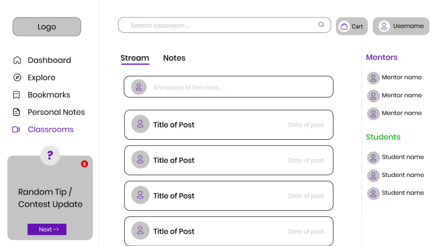
Interface 1 - Google Classroom Style
The Stream tab shows all the announcements (may or may not contain notes) any learner sends in the classroom on which others can comment and give feedback to them. This allows the entire population base of the classroom to interact with each other in just one place.

The Notes tab shows all the notes sent by any learner who is a part of that classroom.
Interface 2 - Discord Style
In this version, we decided to collapse the main navigation bar to just the symbols and allow for different channels inside the classroom (according to the classroom admin decisions). This follows a discord-based layout allowing separation of concerns within the classrooms (channels can be like, doubts, note-sharing, etc). The notes icon in the top right signifies the 'Notes' tabs. It would contain all the notes shared within the classroom.
Which classroom style do you prefer? Do tell us in the comments which 'Classroom' style you prefer (as I don't know how to create a poll on HashNode😭).
Please do share your opinions on the design of the application to improve it. We would love to know about any features you would like to see in the product.😊
Ideas Proposed
Some of the ideas that we came up with during our discussions are:
- The 'Bookmarks' and 'Personal Notes' sections can be shifted from the side navigation bar to a sub-menu under 'Username' (Top-right) thus, reducing the space consumed in the navigation bar. - @Shivansh Pandey
- We can provide a few sets of theme colors to the user (apart from 1 default theme) from which the user can choose to customize the web application to their taste (like the one introduced on the Twitter website). - @Anand Singh Tanwar
Future Steps
- Our first immediate goal is to finish a high-fidelity prototype of the application.
- Right now, we have planned to use Electron (with ReactJS) to build the product.
If there is a better alternative to build the application, do let us know as anyways we'll have to learn Electron as we have no experience with it - any resource links are greatly appreciated.
Conclusion
This sums up the progress we have made regarding the application. Your suggestions are required to shape the product to provide the best possible notes for students. So do leave your suggestions, improvements, or features you wish to see in the application.


Top comments (0)