Over the course of the past 15 weeks, I have had the opportunity to dive into the creation of web components. Early on in this process my team and I created the penguin button and a learning card. Finally we have reached the end in which we decided to create a flashcard.
The Example
This was the base, the muse if you will, for our final project. This flashcard was apart of a set but we originally intended on just creating a singular flashcard.
The Idea
Our plan was simple, create a similar looking flashcard with a few tweaks and additions. The main thing we added was the ability to retry a problem as the original example lacked that feature.
Next was to make it so that the user can easily input a topic and have an auto generated image.
We also wanted the card to be able to change color and still look pleasing so we utilized simple colors to do so.
Lastly was to create the overlay to indicate a correct and incorrect answer.
The Final Product
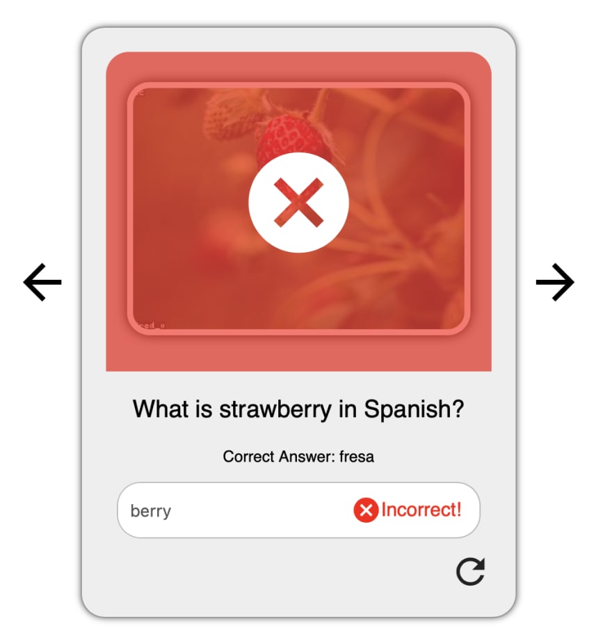
This is the card which we ended with. If the user inputs a correct / incorrect answer an overlay will cover the top of the card as shown below:
We wanted to make sure that it was very clear to the reader the status of their answer. Now you may look at these photos and be wondering what those arrows on the side indicate.
Since we were able to finish the flashcard with time to spare, we implemented a carousel to the flashcard which allows for users to enter an array of questions and answers and go through the group.
My Contribution
My role for this card was mainly the stylistic aspects! The thing I am most proud of however is the overlaying (which admittedly took a lot of trial and error). My solution was utilizing different div classes. :host, and :before. Here is my pride and joy (which hopefully can save someone the stress I faced trying to get the dang thing to work)
  static get styles() {
    return css`
      .overlay {
        position: relative;
      }

      .overlay::before {
        content: '';
        width: 100%;
        height: 100%;
        position: absolute;
        border: 1px;
        border-radius: 19px 19px 0px 0px;
      }

      simple-icon-lite {
        --simple-icon-height: 100px;
        --simple-icon-width: 100px;
        color: white;
        transform: translate(-50%, -190%);
        top: 50%;
        left: 50%;
        z-index: 100;
      }

      :host([status='pending']) .overlay::before {
        display: flex;
        background: transparent;
      }

      :host([status='correct']) .overlay::before {
        display: flex;
        background: green;
        filter: opacity(0.65);
      }

      :host([status='incorrect']) .overlay::before {
        display: flex;
        background: red;
        filter: opacity(0.65);
      }
    `;
  }
Essentially what this is doing is setting the overlay depending on the status and creates the effect shown above.
If you want to get a deeper look into the inner workings of this overlaying system, as well as our flashcard as a whole you can check out our PenStat GitHub and Npm!
I am grateful for all I have learned over the last semester and stay tuned for more coding shenanigans next semester!
PenStat Links
GitHub: https://github.com/PenStat/
Flashcard GitHub: https://github.com/PenStat/penguin-project-three
NPM: https://www.npmjs.com/org/penstat2


Top comments (2)
Now that’s an interesting project! Was your team considering adding attributes to those cards, like grouping them by subject, by level of complexity of the questions or by the number of times the student answered the question correctly?
Since we were on a time constraint due to the project being our final, we did not think of implementing those attributes. If we were to have had more time I feel like we definitely would have tried to implement some of those things.